Last Summer we decided to update the look and feel of our apps. This post shares our process from start to finish. It’s broken up into four sections:
- Why we prioritized a redesign
- Our goals
- Our plan of attack
- The (latest) results
1. Why Prioritize a Redesign?
There are many reasons to prioritize a redesign: fix usability issues, re-prioritize the problems you’re solving, align with the latest design trends, improve intra-app and inter-app consistency, as part of a rebrand, etc. While this project was initially triggered by wanting to make sure our designs were consistent with the new iOS 11 styles, we ultimately decided to expand the scope and prioritize a more comprehensive redesign across all our platforms. At a high level we aimed to:
- Create a more trustworthy experience
- Remove unnecessary distractions
- Design and develop new features more efficiently moving forward
Creating a More Trustworthy Experience
People are (rightly in many ways) skeptical of the secondary ticketing industry. Accordingly, it’s important we do whatever we can to make a good first impression. Using consistent messaging and styling across a user’s entire experience (subway ad, app store, onboarding, emails, intra-app, etc) can go a long way in helping users feel more confident about buying tickets on SeatGeek. While we are proud of many aspects of SeatGeek, the consistency within and across our apps was not one of them before we started this project.
Removing Unnecessary Distractions
Simplicity is one of our core product values. While we generally try to avoid unnecessary elements and features throughout the design and development process, our iterative approach can lead to some nonessential features slipping through the cracks. We saw this project as an opportunity to cut back the visual noise and put more emphasis back on the core features of our apps.
More Easily Designing & Developing New Features Moving Forward
Over the past couple years there have been many advances in frontend technologies and design tools to make it easier to create, maintain, and use a modular design system. On the design side, you can create reusable symbols in Sketch and share these symbols across files using Sketch Libraries. This isn’t even taking into account all of the new tools like Figma and Invision Studio that have been built from the ground up with components in mind. On the development side, you can now build a react component once, document it using Storybook, and reuse it throughout your application. If you’re really fancy you can even leverage Airbnb’s React Sketch app to automatically generate these React components in your Sketch files. With a bit of upfront investment, all these new technologies can radically improve the speed and ease at which you build new features, and also ensure you’re being as consistent as possible.
2. Goals of the Redesign
We took the above ideas and distilled them down to the following success criteria:
- Being more consistent
- Intra-platform (including latest OS trends)
- Cross-platform
- Between marketing and product design touch points
- Having the designs and interface work in a modular manner
- Doing the above without hurting conversion rates1 or upsetting core SeatGeek users2
3. Plan of Attack
When starting this initiative, we knew we wanted to take an iterative approach, where each phase could stand its own but also build towards a more ambitious long term goal.3 You may be thinking, “How the hell do you iteratively roll out a redesign?” If you are, you’re not alone. However, when we started thinking more about our goals, we realized that we could accomplish a lot of what we were aiming for (consistency, modularity, and simplicity) without radically changing the look and feel or structure of the app.
Based on the above, we decided to break out this redesign into two phases. The first (main) phase consisted of updating the look and feel of our apps and making sure all elements are part of a cohesive system. This phase did not involve any radical structural changes, so we’ve been referring to it as a “Visual Refresh.” This foundation laid the groundwork for the second (much longer, practically never-ending) phase of using this new modular foundation when working on future projects.
To help us learn even more quickly (and partly due to design capacity) we decided to work on this one platform at a time. We started working on the modular design system on iOS, then took those learnings to other mobile platforms, and are just now beginning to apply this system to our desktop site. Additionally, to go along with the iterative spirit we focused our efforts solely on the core functionality of the apps to help keep the scope manageable.4
4. How’d It Go?
What Went Well
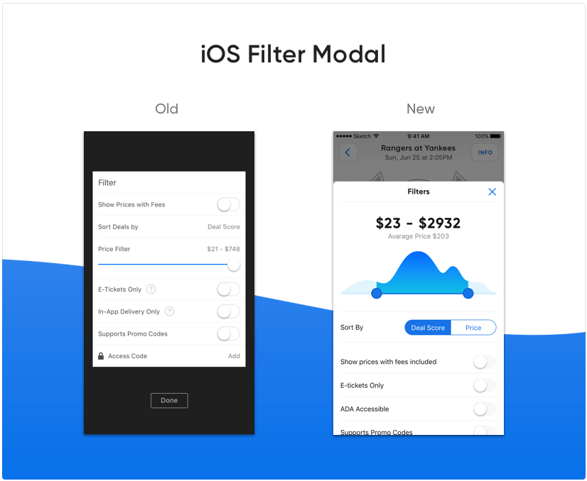
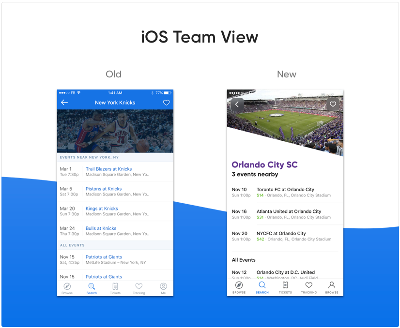
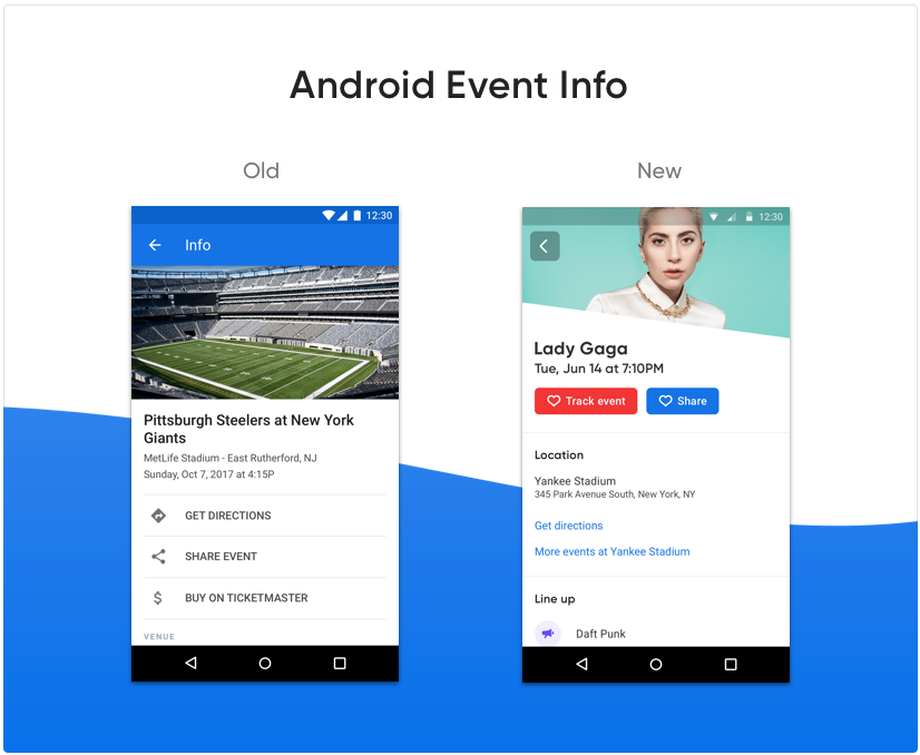
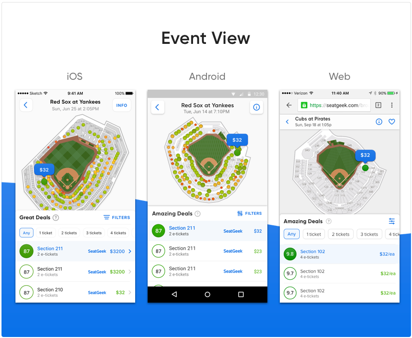
While we’re still far from finished, overall we’re extremely pleased with how this project has gone so far. As of now we’ve launched Phase 1 across iOS, Android, and mobile web, and are currently begin the design stage of Phase 1 on desktop. While in some ways the launch of the visual refresh was a bit anticlimactic, when working on a project like this that’s not necessarily a bad thing; the apps are way more consistent, the new designs work in a very modular fashion, and we did the above without hurting conversion rates or upsetting core SeatGeek users. Additionally, we now have a great new foundation to more quickly build incredibly consistent and delightful features. Given that this project was highly visible, some examples will be more effective at sharing the results.
What Could Have Gone Better
While we’re pleased with how the initial phase of the project went overall, there were certainly things that could have gone better.
For starters, it took us much longer than expected. In particular, we underestimated the amount of time it took to apply the system to the long tail screens and features5. There were also some more custom elements we decided to incorporate into the designs (custom nav bar, custom animation when selecting a ticket) that ended up taking longer than expected to get right. While these ended up being some of the more delightful pieces of the new version, they did drag the project on a bit longer than expected.
Related, while we were able to design most of the core screens in a modular fashion, we ended up deciding not to implement all of it modularly in order to make time for other initiatives. While modular designs alone are a step in the right direction, translating this modularity into code is vital to fully take advantage of the benefits of such a system.
Lastly, while there is certainly much more consistency both intra- and inter-platform, there is still a lot of room for improvement. In particular, we’ve found it more challenging than expected to balance platform paradigms with cross-platform brand consistency.
On the bright side, all these challenges have been great learning opportunities. Given that this is a never-ending type of project, we’re able to put these lessons to work right away!
What’s Next?
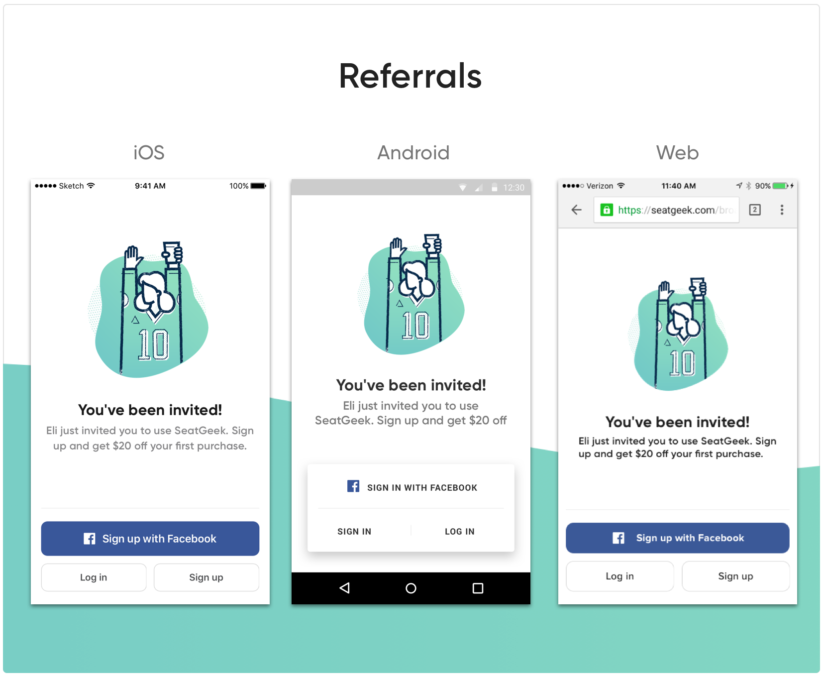
We’re currently focusing on applying the same strategy to our desktop site. There are a lot more features and screens on desktop, so it will likely take us a bit longer than any of the platforms we’ve already worked on. In addition to the desktop visual refresh, we’re also beginning to use the new system for all new features. Referrals (which we’re in the midst of beta testing!) is a great example of the new system in action:
We’re also improving the design system based off of what we’ve learned actually using it. These improvements include making it more accessible, putting more emphasis on component language consistency, and more clearly communicating the rationale behind certain patterns. We’re really excited about the progress we’ve made, but also realize that we’re really only getting started.
Whether you’re trying to get a redesign prioritized or in the process of planning for a similar project, we hope you have found it helpful to understand how we approached this type of project. We’re always looking for ways to improve, so if you have any design system suggestions (or questions), don’t hesitate to reach out to design@seatgeek.com.
Notes
1We decided not to specifically aim to improve conversions because (as you’ll read later), we decided to approach this in a very iterative manner, so much so that we didn’t really expect to drastically affect conversions one way or the other. However, given that when you make large changes there is always a chance that you introduce bugs or affect the experience more that you expected, we wanted to make sure we didn’t negatively affect any metrics.
2In general people don’t like change, so it’s important to be mindful that any large changes may leave a sour taste in people that are very familiar with your platform even if there are good reasons for those changes.
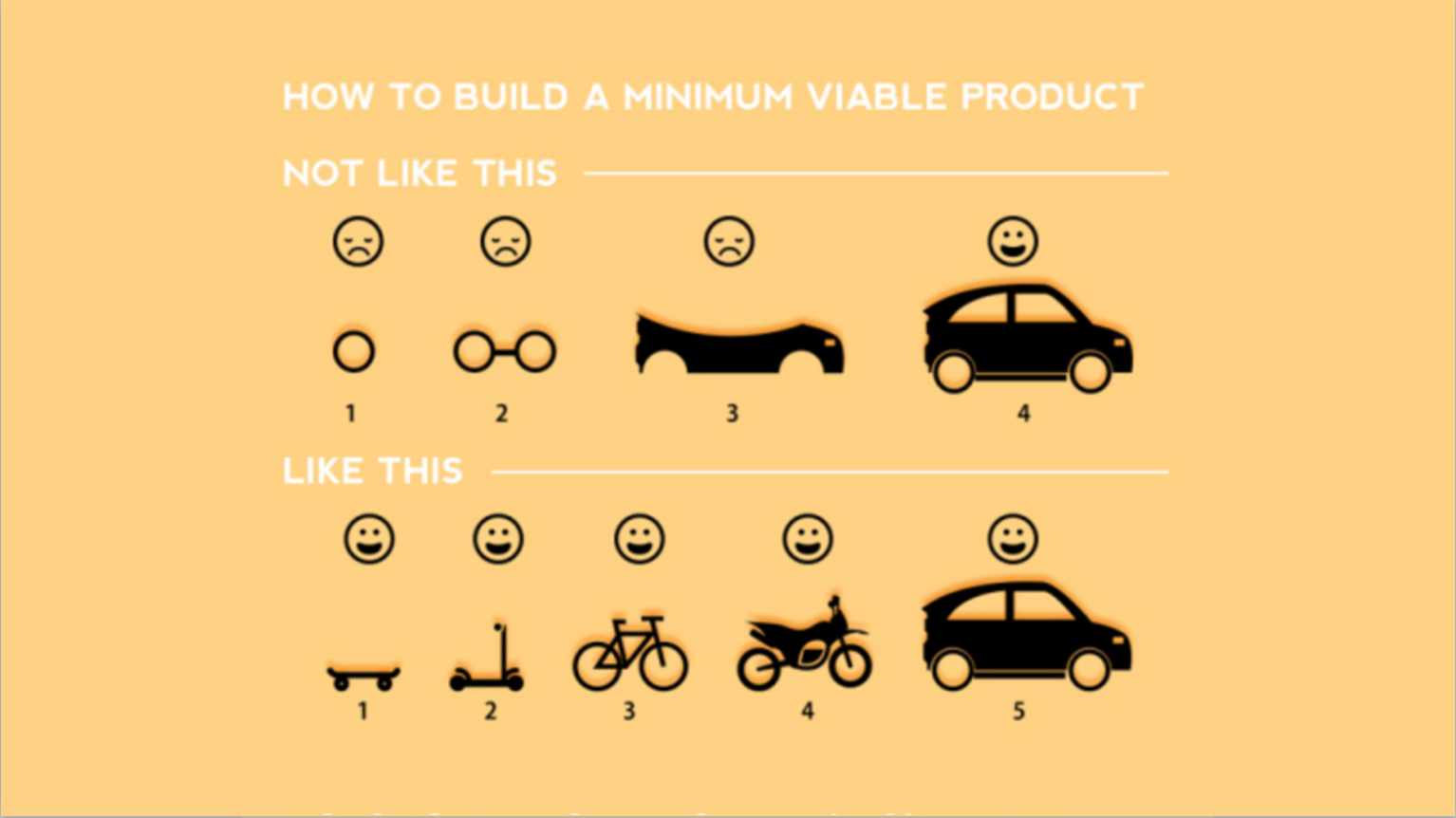
3Allowing us to test hypotheses early on and learn from our mistakes earlier as famously depicted in this great slide.
4We still made sure the experience looked decent on non-core features, but we didn’t spend time building each from scratch and making sure it worked seamlessly with the new modular system.
5Despite the focus being on core features, we still need to make sure that the new look and feel worked across other areas of the apps.