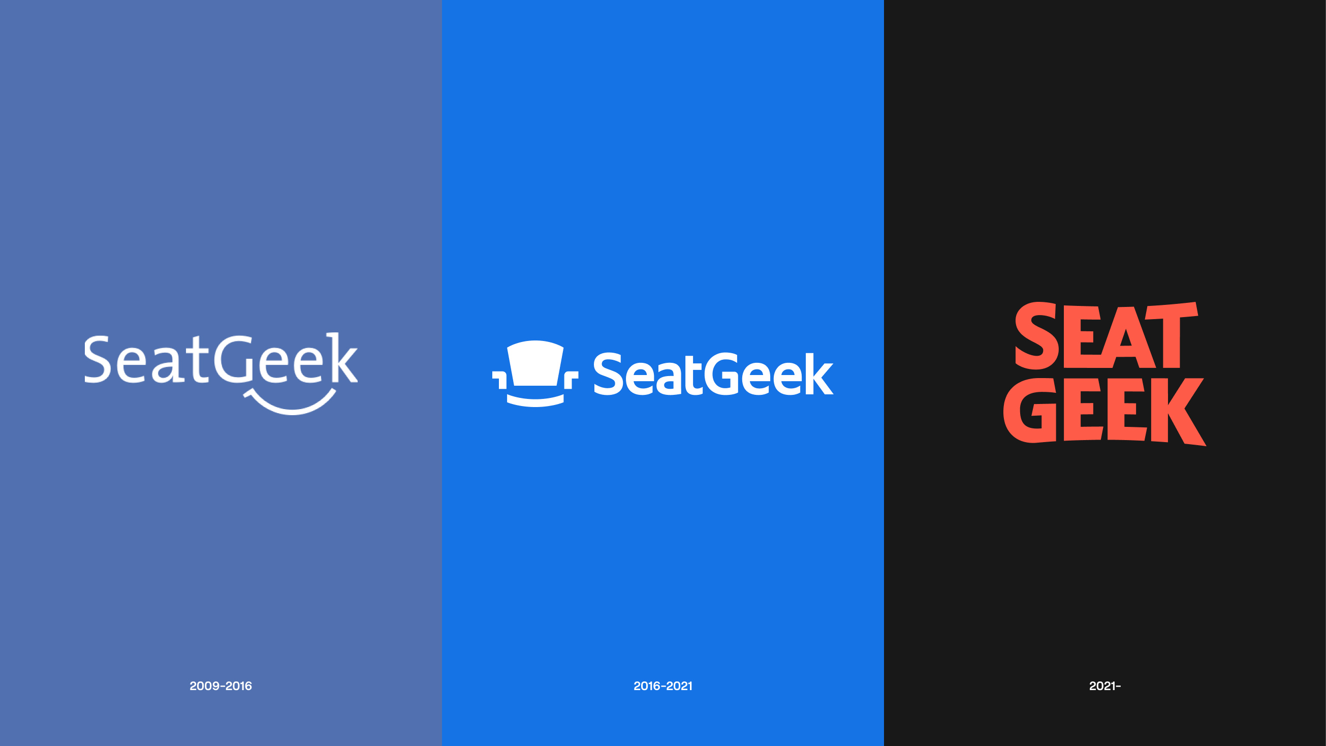
SeatGeek was started 12 years ago because we knew ticketing could be better. Since then, we’ve pushed the industry forward through product innovation: launching a top-rated mobile app, becoming the first to introduce fully dynamic maps, creating a metric to rate tickets by quality (now an industry norm) and introducing fully-interactive digital tickets with Rally. While our product is beloved by those who use it, the vast majority of fans have never heard of us.
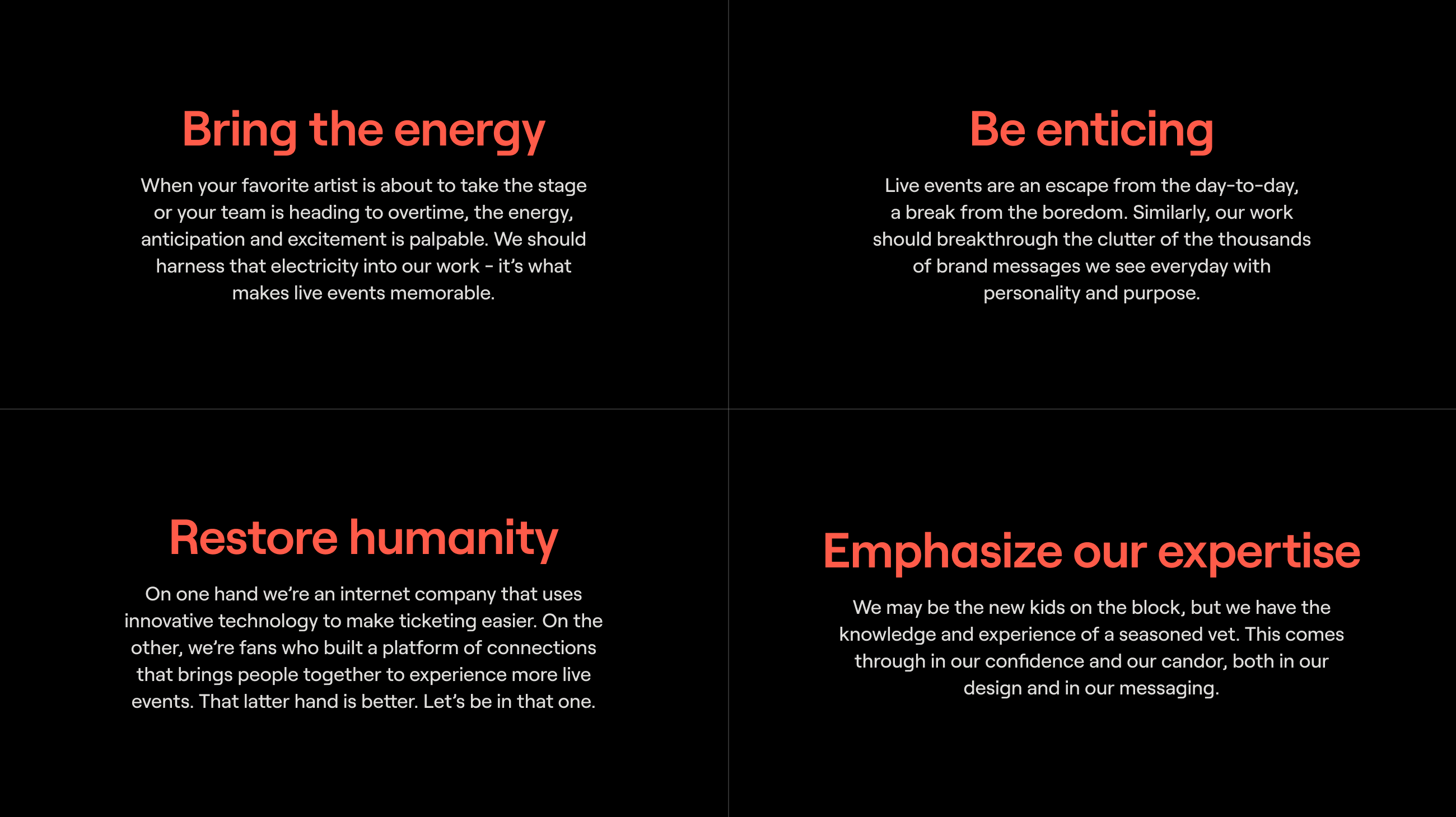
So we think it’s time to bring the SeatGeek brand to the masses. To help us achieve this goal, we used this past year to rethink our brand strategy and reimagine our look and feel. We focused on creating something:
- Bold like the events we ticket
- Human like the emotions they evoke
- Distinct from our competitive set
- Confident in our expertise
See below for the full principles that guide our new brand:
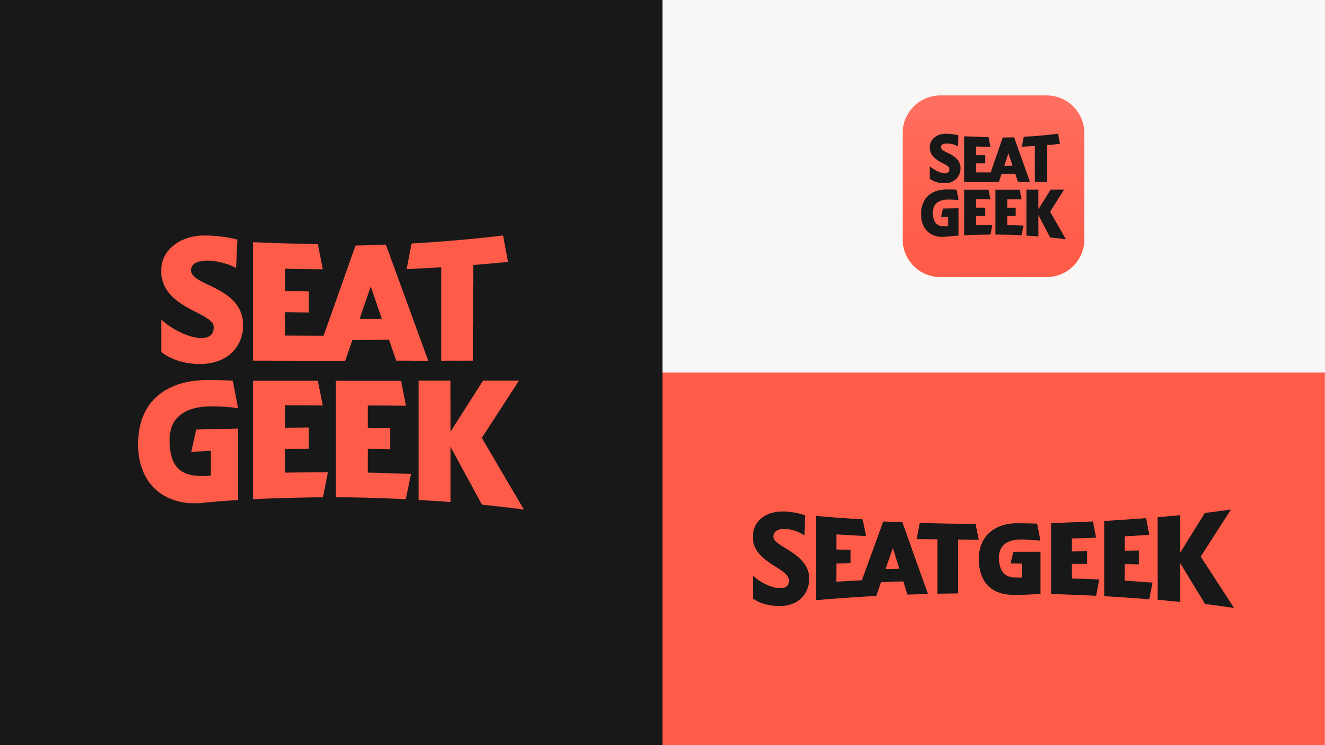
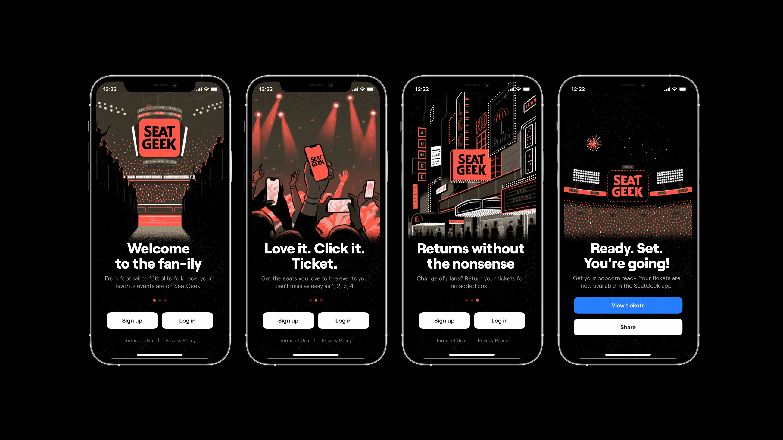
Today, we’re excited to share SeatGeek’s new look. From our logo to our app and everything in between, our new brand represents everything SeatGeek is and what we bring to ticketing. Here are some of the foundational elements:
While technology has changed how we can experience live, our “why” for loving them is timeless; they are unpredictable, emotion driving, life in HD. Our tech expertise is lived out in the products we build, services we provide, and industry-shifting strategies we execute. To balance that, our new brand leans into that unchanging magic of live events. Retro concert posters, trading cards, tangible ticket mementos, lit-up marquees - we will take the opposite approach of the landscape right now, and “go back” to push forward.
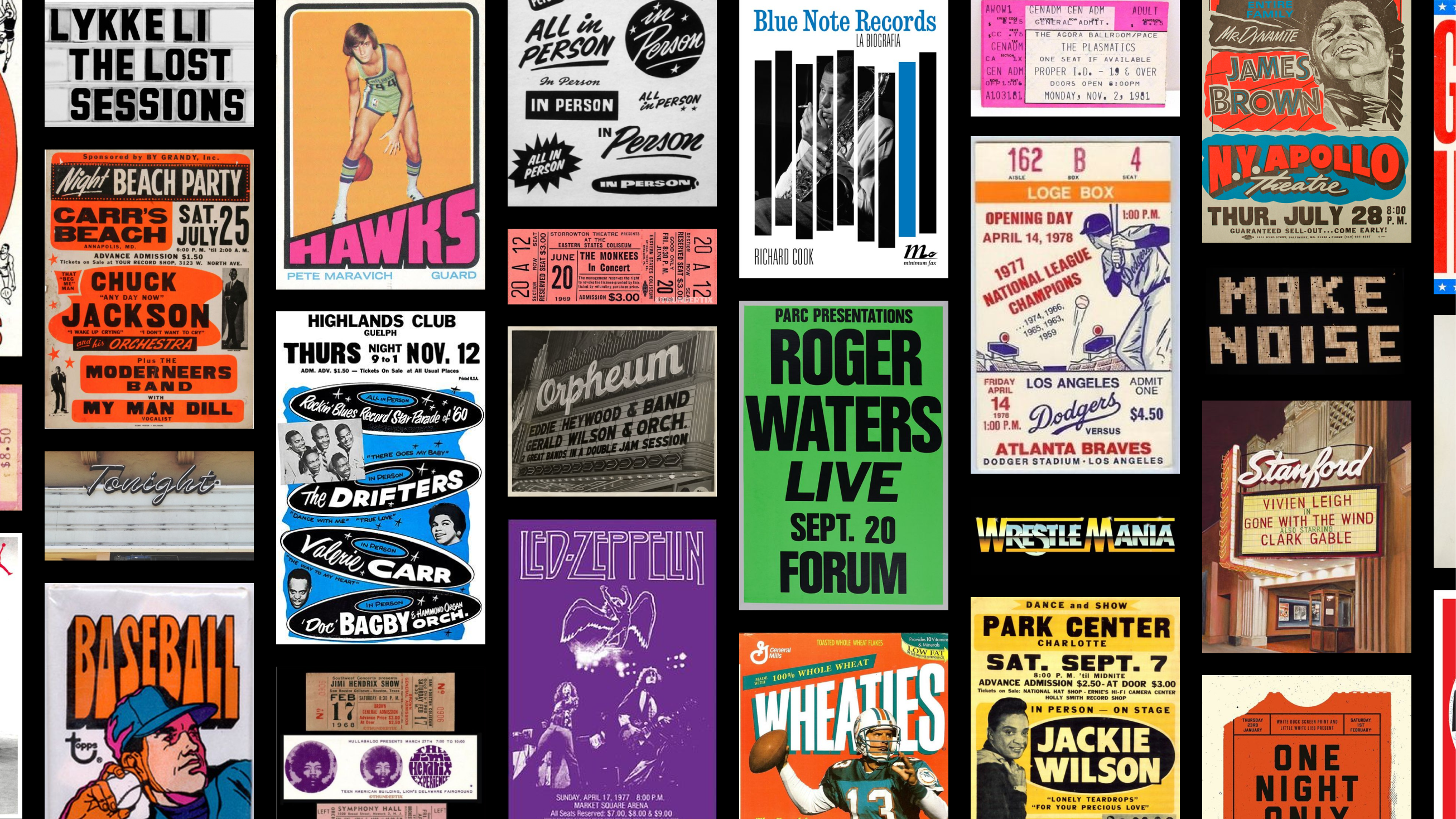
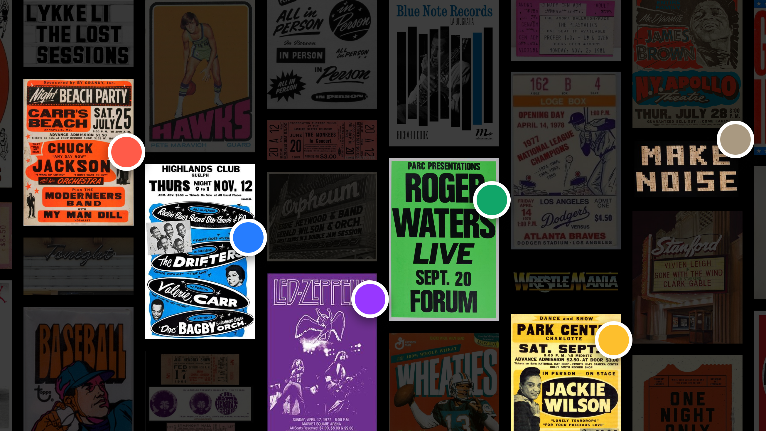
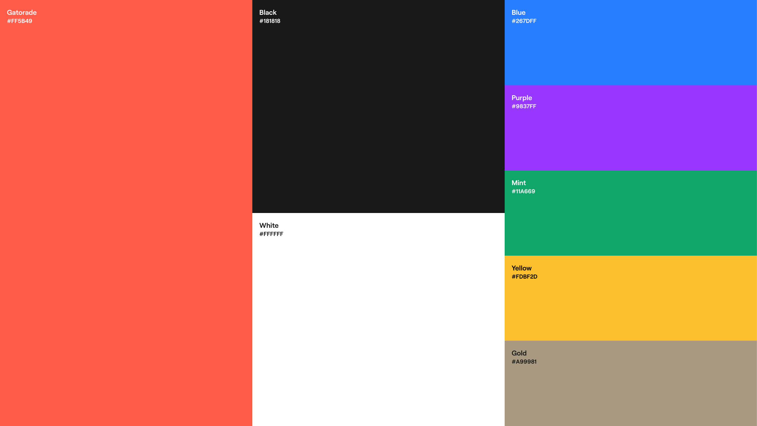
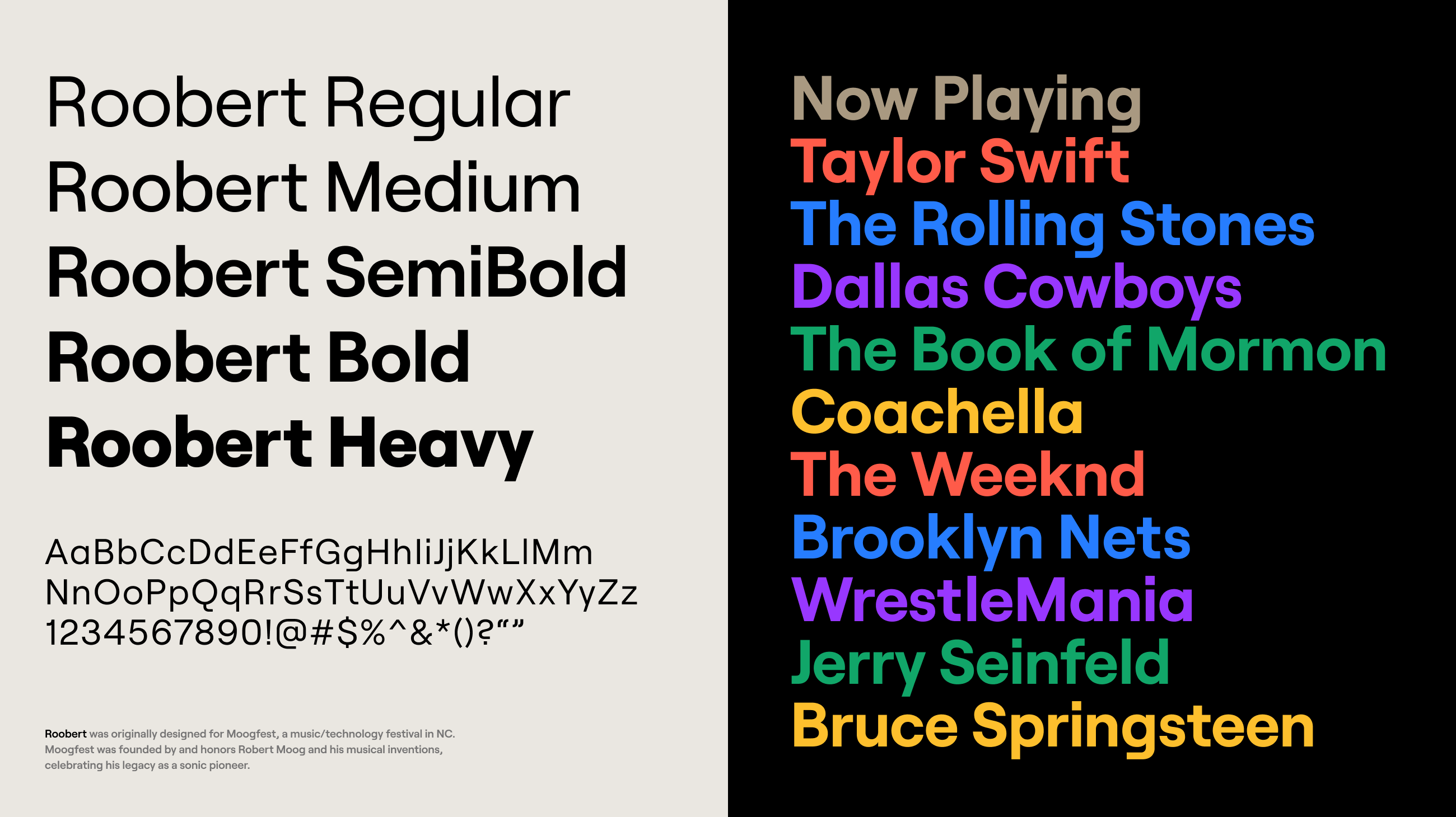
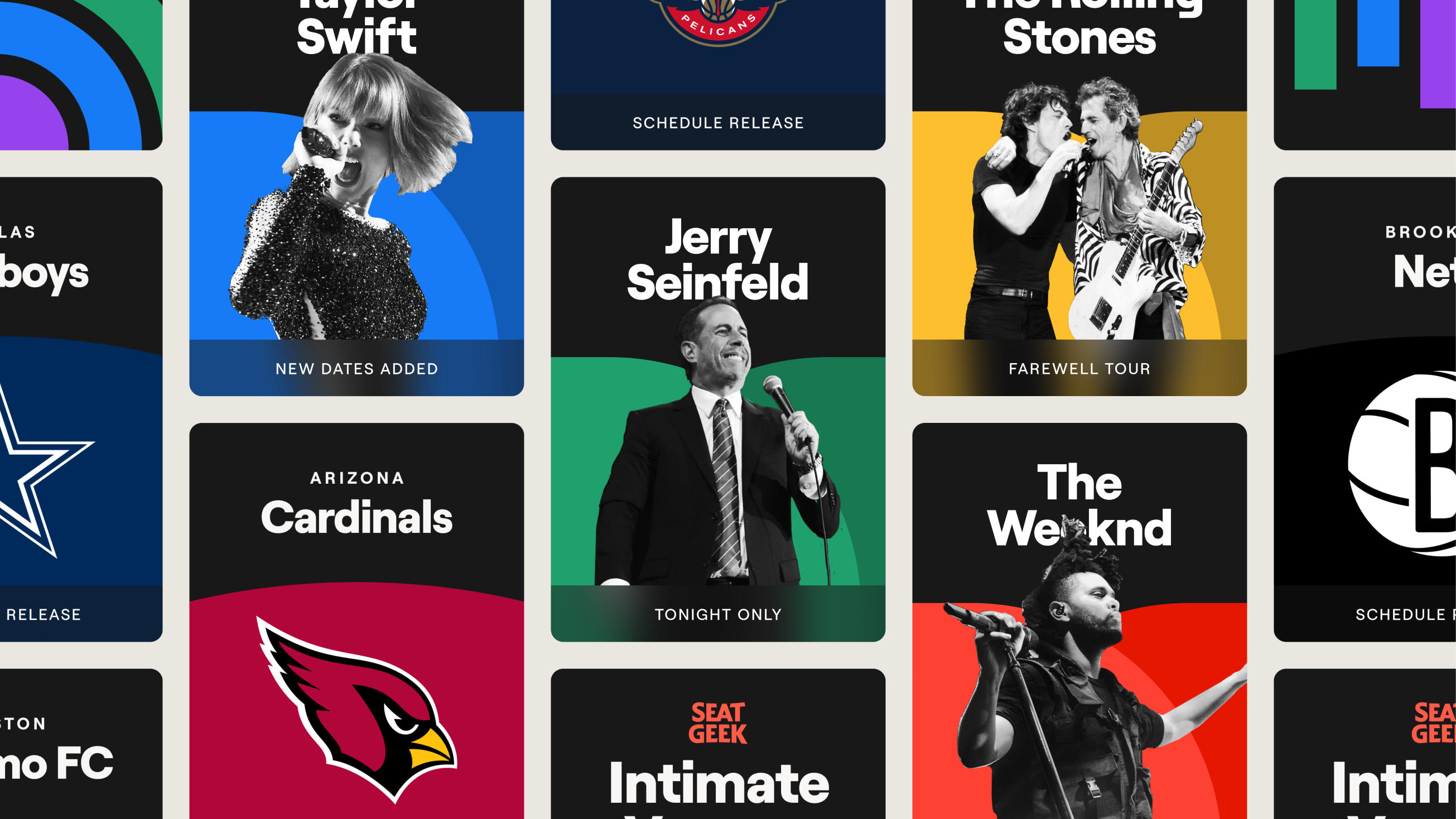
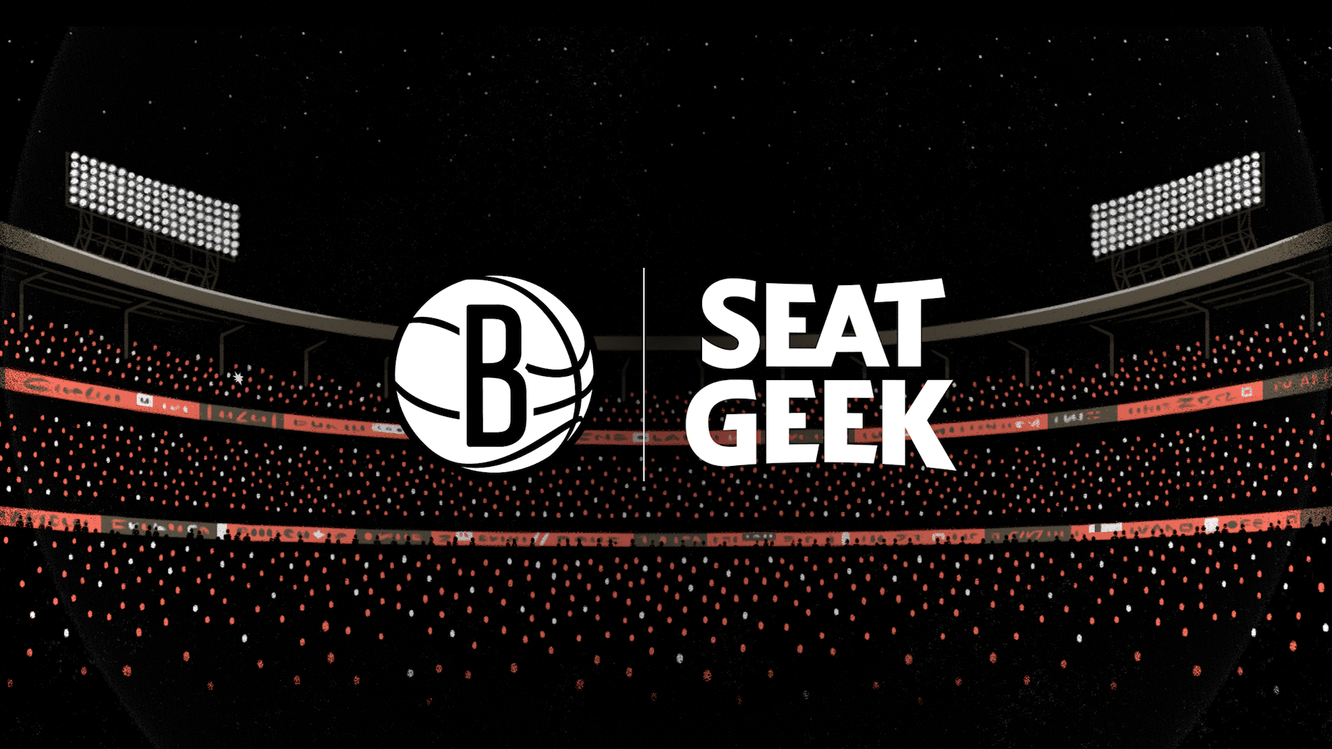
We believe the new brand balances the innovation with the history, the modern with the retro, the future with the past. We accomplish this through a bold, yet approachable wordmark, a tangible color palette, an inviting tone of voice and more. All at the service of the die hards, the Deadheads, the rodeo fans, and the Broadway patrons alike. See below for examples of the new system in action:
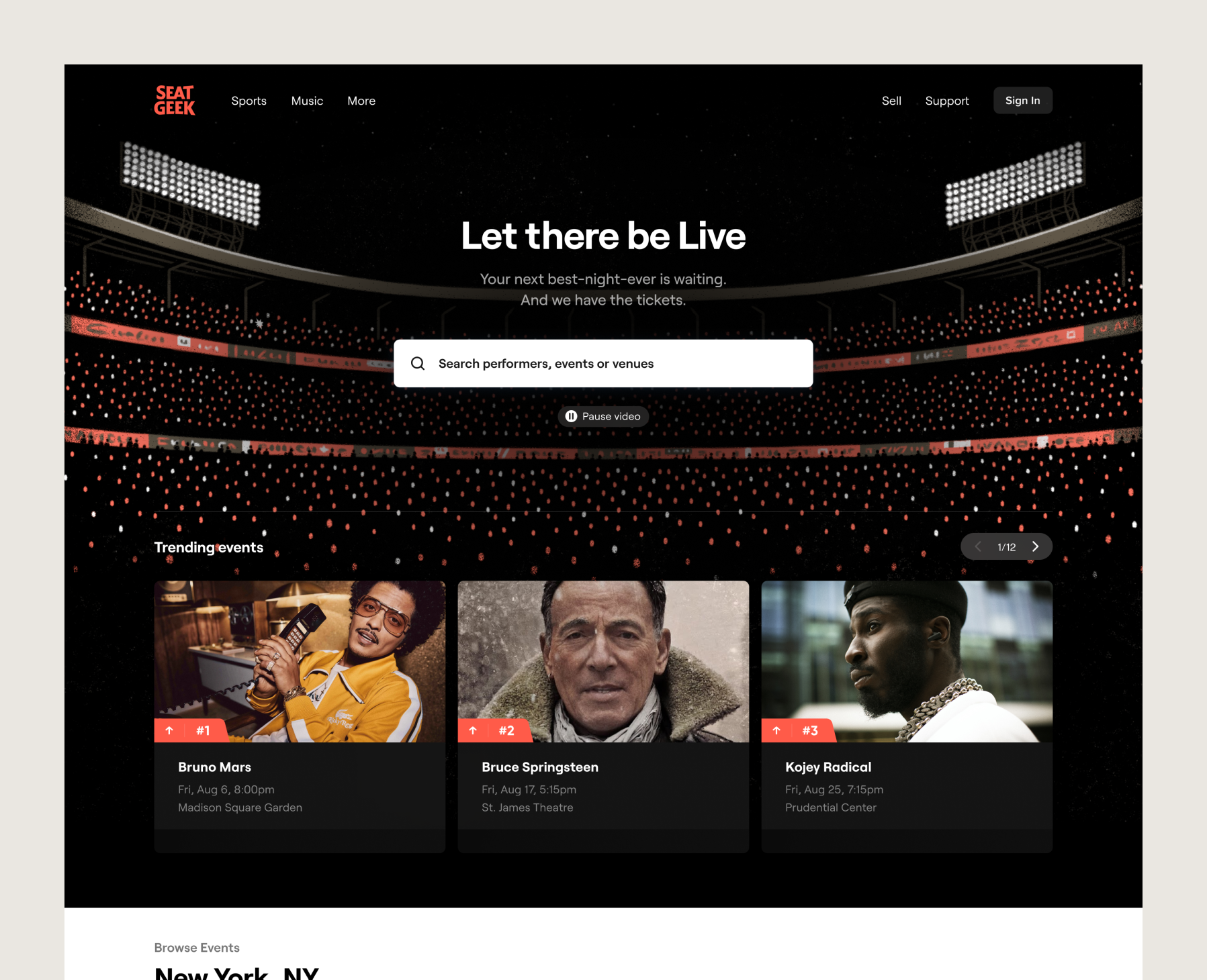
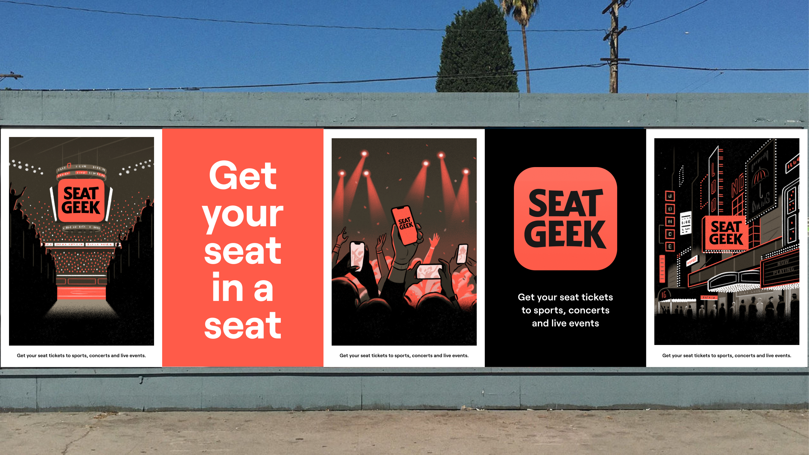
![]()
We married our own obsession with the ticketing space with a diverse roster of talented partners that brought their own perspectives and inspirations, including Mother Design, Hoodzpah and Mickey Druzyj, to provide our internal team the tools to bring the rebrand to life across our many products and channels.
We believe great brands belong to the full organization, so to that end we ensured a broad group from across the organization was involved in the rebrand process. We’re excited to launch this rebrand as live events come back, and we believe they’re better than ever with SeatGeek.