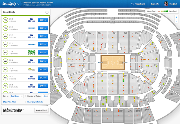
If you think about SeatGeek like we do, then in your head you probably picture an event page. You know, the page that has the venue map, the colorful dots, and the big list of tickets from all over the web, ranked by Deal Score. All the best reasons to know & love SeatGeek are encapsulated in this one single page. And it is not only the functional core of SeatGeek, it’s also our most highly-trafficked page type.
With so much riding on the event page, we’re constantly working on incremental and under-the-hood improvements. We normally avoid committing obvious, disruptive changes, but a few times in SeatGeek’s history we’ve launched major redesigns of our event page—the most recent of which happened earlier today.
Here I’ll give an overview of the latest changes and, for posterity, a quick tour through earlier SeatGeek event page history.
Today’s release
Inspiration
In the year and a half since we launched the last major version of the event page we started making mobile apps. Designing for mobile devices forced us to reconsider the SeatGeek experience from scratch, and once we launched our apps—in particular our iPad app—they became new sources of inspiration for the website. For example, we began to think much harder about conservation of screen real estate.
Internally, today’s milestone inherited the name “Omnibox” from an eponymous Google feature. Not Chrome’s address bar, but rather a more obscure reference to a CSS class found in the new Google Maps’ control panel. Although many people have griped about Google Maps’ recent update, we admired the idea of having a single page element whose content could change based on interactions with the underlying map.
What changed
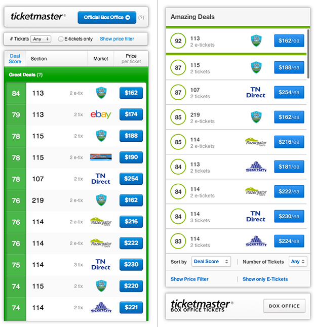
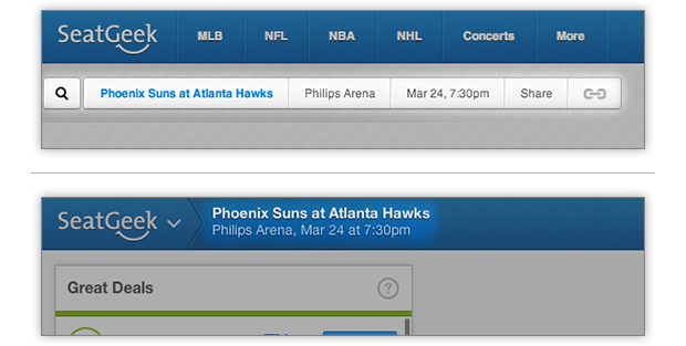
In the main sidebar, we swapped our large, color-filled section headers and deal score labels for more elegant circles and lines that more closely resemble our latest iOS designs. We also moved the filter controls and box office link from the top of the sidebar to the bottom. The result is that ticket listings get higher precendence on the page.
The new version of the section info view (below, on the right) looks very similar to the old, with the notable exception that it doesn’t appear in a popover overlaid on the map, but rather in the sidebar. Popovers had a lot of annoying characteristics, not least of which was that they were starting to feel decidedly web-1.0-y. As an added bonus, under the new sidebar scheme, it’s now possible to apply search filters to tickets within individual sections.
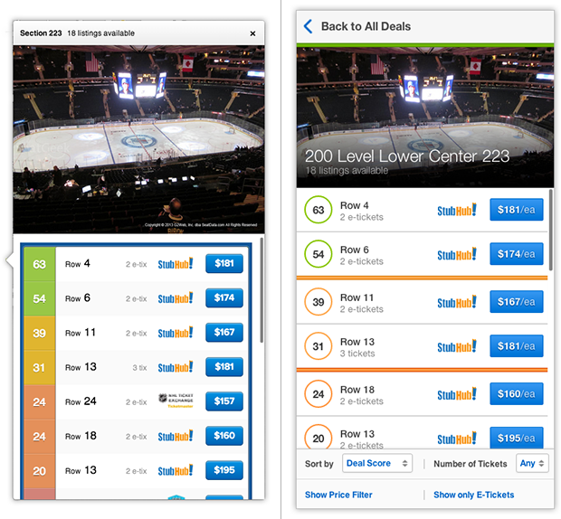
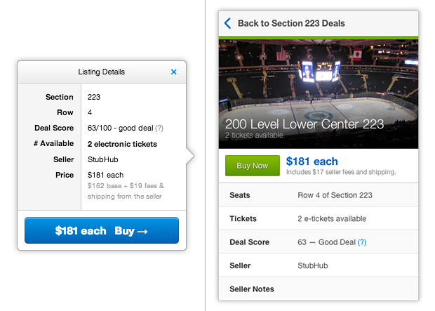
If you can believe it, the old version of the ticket info view (below, on the left) was actually a second popover that appeared beside the first popover containing section info. Now that all this information is in the sidebar, the map won’t get cluttered (which was especially problematic on smaller viewports), and the ticket details are much more legible.
Last but not least, we moved the old event info bar (seen in the top half of the image below) into the site header. This frees up more space for the venue map. In order to make room for event info in the new site header, we consolidated the category page links (i.e. “MLB”, “NFL”, etc.) into a dropdown off the main SeatGeek logo.
To really get a feel for the wonders of the new event page, you should really check it out. Go try a search, or check out one of these random event pages.
Earlier event pages
Here we take a walk down memory lane, through the annals of SeatGeek event page history. We’ll begin with the very first 2009-era event page before venue maps even existed and end on today’s latest event page release, ten notable iterations later.
Full disclosure: there’s a gratuitous, self-indulgent number of screenshots ahead. Only the most obsessive SeatGeek fans need read any further.
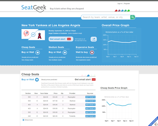
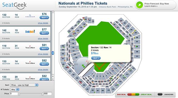
#1 The original SeatGeek event page was launched—along with SeatGeek itself—in September 2009. It contained no venue maps. SeatGeek was all about price forecasting, and making recommendations about whether to buy a ticket now, or wait to buy. If you wanted to buy, there was a table of tickets from various sellers, sorted by price.
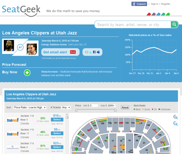
#2 In early 2010, SeatGeek licensed the rights to use venue maps, provided by a third party named SeatQuest (now defunct). According to engineer #1, working with SeatQuest maps was reportedly a nightmare.
#3 Before long, ticket listings and venue maps started stealing screen real estate away from the price forecast part of the page.
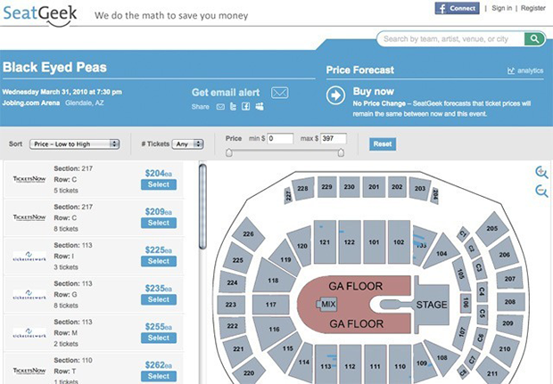
#4 The event page’s first major redesign happened in Summer 2010.
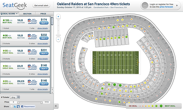
#5 Soon after the Summer 2010 redesign, we scrapped SeatQuest in favor of our own venue maps, which should look a lot more familiar to current SeatGeek users. Also worth pointing out that by now the price forecast feature is relegated to a small-ish button area above the map, and restricted to signed-in users.
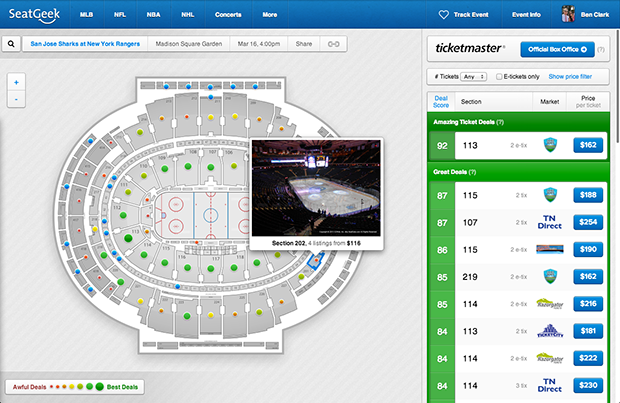
#6 Sometime in early 2011, we made the long-standing switch from a lefty sidebar to a righty—a change that would persist all the way until yesterday.
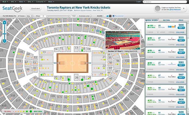
#7 In mid/late 2011, we redesigned the site again. Note the dark blue primary colors, and the new styling for the sidebar.
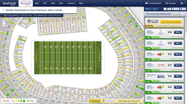
#8 In the first half of 2012, the dark blue from the previous version softened into the lighter SeatGeek blue of today.
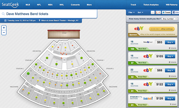
#9 This update featured some new sidebar styling and abolished the permanently overlaid search bar in favor of a more compact event info bar. This version reigned supreme from Fall 2012 all the way until March 12, 2014.
#10 Omnibox: The cleanest SG event page yet. (Note the lefty sidebar, a clear throwback to the year 2010.)