
At SeatGeek, our interactive venue maps are something we take a lot of pride in. We are constantly striving to make our maps more useful, performant, and beautiful. Whether this involves us opening up the MLB rulebook in order to get the pitcher’s plate on baseball fields correct, or implementing a custom canvas tile layer to achieve buttery smooth, 60FPS map interactions, we are always looking for ways to improve.
In this post, we will discuss something a little more hidden from the day-to-day customer interactions with our venue maps. Over the past several months, we have drastically changed the way our maps are created, updated, stored, rendered, and served. For now, this has very little effect on the appearance and usage of our maps, but it lets us produce new maps faster (turns out Taylor Swift fans don’t like waiting for maps) and opens up a multitude of ways in which we can use our maps data.
Background
Maps have been a core part of SeatGeek since the very early days. Initially, we used a variety of third-party venue map services. While these services were functional, we felt somewhat constricted by them. We had very little control over the styling and no direct control over fixing any mapping mistakes or prioritizing new maps. Additionally, most of these tools used older technologies, such as Flash, whereas we wanted to build our site using a more modern web stack. Therefore, we decided to bring map creation and interface development in-house. An early third-party map can be seen here in a throwback event page from 2010:

Original Mapping Pipeline
Our original mapping pipeline was conceived to launch by the 2010 NFL season and has remained mostly unchanged since then. Maps are created in Adobe Illustrator by a group of very detail-oriented people on our mapping content team. Aside from some scripts that assist with drawing rows and labels, this is mostly a manual process. These SVGs are uploaded to a web service that pulls out some simple geometry data which is used for drawing highlights as well as placing the DealScore markers. It then takes the vector SVG and performs tile-cutting, producing a set of square raster tiles for each zoom level that we support in our clients.
The geometry data and associated raster tiles are stored in Amazon S3. When map data is requested, whether for an event page, venue page, or visualization, a lightweight (and heavily cached) service serves this data from S3 without any modification.
Advantages
This system is really nice due to its simplicity. Mapping outages are exceedingly rare due to the fact that we are just serving from S3. A map SVG ingested into the system is effectively guaranteed to look exactly as planned when a user requests that map.
Disadvantages
The downside of this system is a complete lack of flexibility. We have thousands of rendered maps sitting in flat files on S3. This means things as simple as “change the color of the sections” or “change the fonts of the labels” would require thousands of files to be altered and reprocessed. Additionally, it is hard to answer any questions about our data, e.g. “how many rows does section MVP 117A have at Yankee Stadium?”
Goals
Our primary goal has been to essentially “unlock” all of this valuable and interesting information we had sitting in thousands of flat files. Therefore, we needed some sort of persistent datastore in which to store our map geometry and associated metadata. Additionally, we really wanted to separate the data from the presentation. For example, instead of storing the color and stroke of a section object alongside the geometry, as was done in the SVG, we wanted to style objects, labels, and fields based on a series of rules. Finally, we wanted to be able to do this on the fly, rather than pre-baking a set of image tiles for every map. This would let us more quickly and dynamically make changes to our maps.
GIS Pipeline
When looking for inspiration for our new pipeline, we looked towards the world of GIS (Geographic Information Systems). There is very impressive work being done in this field and a substantial number of mature open source projects as well. In particular, the Mapbox team has made some great open source contributions. Many of the most difficult aspects of creating a map pipeline and serving geospatial information have been solved in these projects and systems, so we were eager to use and mimic them heavily.
One of the inherent complications of our maps is that they are 2D projections of a 3D, overlapping structure. When creating our maps, we have several constraints that we try to balance: the map should be generally the shape of the venue, each section should be fully visible, and sections should generally have the correct spatial orientation with respect to each other and the field. There is a lot of artistic leeway in how these sections are portrayed.

Due to this, we are unable to use true latitude/longitude when storing our maps. However, given that none of these tools are designed to work within a local coordinate system, we have to do a little customization (hacking) to make these tools work for us.
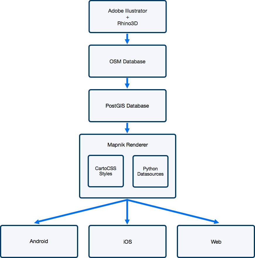
Map Creation
Similar to our original pipeline, our maps are initially created using Illustrator as well as Rhino3D. We have a team that is very comfortable and efficient in these tools, so we did our best to try and fit the pipeline into their workflow rather than the other way around. One of the major changes, however, is that the maps produced in Illustrator or Rhino3D only need to contain the geometry and metadata. The mapping content team no longer needs to worry about section colors, label placement, etc, which greatly speeds up their workflow.
OSM Database
Once a map has been created in Illustrator, it is uploaded to a web service that converts the geometry encoded in SVG paths into Open Street Map (OSM) elements stored in a Postgres database. One of the first challenges is that OSM supports only polygonal data, whereas Illustrator supports Bézier curves. Therefore, we first perform a piecewise approximation of the curves as described by Fisher (2000) [PDF]. Then, we parse the IDs of the SVG elements, which we overload to support inputting arbitrary key-value metadata in Illustrator (e.g. this row is wheelchair accessible).
In OSM, objects are generally classified into 3 categories: “nodes,” “ways,” and “relations.” We found this to be an incredibly elegant data model and it worked fantastically for our purposes. In our world of venue maps, a “relation” would be used to represent a section. This “relation” would have multiple polygons which are the “ways” (many sections consist of distinct shapes in our maps). Each of these ways would have ordered “nodes” that define the shape of the polygon. We use this approach for defining many things, such as rows in a section, sections in a group or level, etc.
Further drawing inspiration from the OSM model, any changes to a map are stored as a changeset, allowing us to maintain an archive of maps at any given point in time without storing an excessive amount of data.
PostGIS Database
While the OSM data model is very flexible and great for maintaining a full history of all the maps, it is not a great format for rendering map data in production. Therefore, we use osm2pgsql to dump current versions of each map into a more “flat” format that is more useful for rendering and geospatial operations.
Map Rendering

For all of our interactive maps, we generate image tiles that the clients stitch together so they appear as one large image. Upon receiving a request for a tile, the tile server calculates the bounding box defined by that tile. The server then queries our PostGIS instance for the relevant geometry and metadata, a particularly efficient query due to spatial indexing.
Given the geometry data, mapnik renders the map tile based on styles that we define in CartoCSS. This lets us style maps using CSS-like style sheets, achieving our goal of separating data from its visualization. Here is an example of what one of our style layers might look like:

Mapnik performs complex operations, such as label collision detection and high-quality antialiasing, and does them very quickly. In fact, the entire chain, from querying PostGIS through responding to the client HTTP request with a tile, takes less time than pulling a static tile in the old pipeline from S3 (all under 100-200ms). Now, we heavily cache these tiles so as to make them load even faster for clients, but it goes to show just how performant these open source GIS technologies are.
Next Steps
To date, we have been working on just achieving parity with our old pipeline, at least from the point of view of a user. However, now that we have all of this geometry data for our maps in a datastore, we are looking towards new ways to use this. Whether it is displaying data visualizations, points of interest, or new ways to interact with our maps on our event pages, we have a lot of possibilities to explore.
Final Thoughts
One of the themes that kept coming up in this project was when to use existing software vs. when to build it in-house. More than most projects we have worked on, this consistently straddled the line of “very similar to existing use cases” but “just different enough to make it difficult.” Although it didn’t always result in the most “elegant” software, we found that the gains from using high-quality open source libraries were more than worth any difficulties. It’s natural for a software engineer to want to write code to solve a problem, but sometimes it’s worth taking a step back and seeing if there are any shoulders you can stand on.
And now a quick plug: If these are the types of problems that excite you, we have a lot more of them in the pipeline. Check out our jobs page and come join us!