Code, Design, and Growth at SeatGeek

Jobs at SeatGeek

We are growing fast, and have lots of open positions!

Explore Career Opportunities at SeatGeek

Visualizing the NCAA Tournament

March Madness is one of the biggest ticketing events of the year, but with 68 teams competing across 14 cities over a period of nearly three weeks, wading through dozens of games and ticket packages to find the right seats is an exercise in tedium. Just about every site you could buy an NCAA Tournament ticket from displays these various packages as one big, ugly list, but we decided there had to be a better way.

Designing a new experience

The objective of this project was to reduce the friction of purchasing tournament tickets, and to do this, we needed to make the experience as streamlined and simple as possible. For March Madness, it seemed obvious that a bracket would offer the most intuitive experience.

But there was plenty of nuance to consider in the design of the bracket. Every decision about spacing, colors, size, information density, and interactivity affects its usability, and with so many events on the page at once, making the wrong design choice could throw off the balance and make it difficult to follow.

To keep this balance, only the absolute minimum amount of information is shown at any given time. Dates and locations are only shown for upcoming games, losing teams are grayed out to make it easier to scan through, and the “Tickets” calls to action are subtle yet clear.

Prototyping

From the very beginning, I knew that I wanted this bracket to be interactive in some way. I built a simple proof of concept to test out designs and interactions, as well as the underlying technology.

The games are set in place using CSS3’s new flexbox model. This makes the code much simpler, since it can automatically handle vertical centering and evenly distributed spacing of elements. But more importantly, it also allows the bracket to be responsive right out of the box, so it can work well on a variety of screen sizes without additional code or markup.

The connecting lines are drawn using Canvas, which offers a simple and high-performance way of rendering lines and polygons. This posed an interesting challenge and was the most difficult part to get right. Drawing lines and bezier curves is easy, but combining them in a way that is responsive is harder.

The S-curves between the round of 64 and the round of 32, for example, require four lines and two bezier curves. The points for each line segment and curve are calculated based on the position of each team. This example demonstrates how the connectors are drawn.

Iterating

Even though it worked well in that demo, the prototype still had several issues. Aside from messy code that’s difficult to maintain, the interactions (based entirely on jQuery) are bad for performance when scaling up to 63 games for a total of 126 teams rendered. Every time an element on a page is updated to, say, add a hover effect, it requires an expensive DOM update that slows down the page. This is difficult to optimize using just jQuery selectors and events.

Resolving this issue was easy thanks to React, Facebook’s reactive UI framework. React’s virtual document object model means that we can limit the number of times that a DOM update has to happen. That can even allow us to build complex interactive elements like this graphic in a relatively high-performance way without sacrificing usability.

Take a look at the live version of the bracket here.

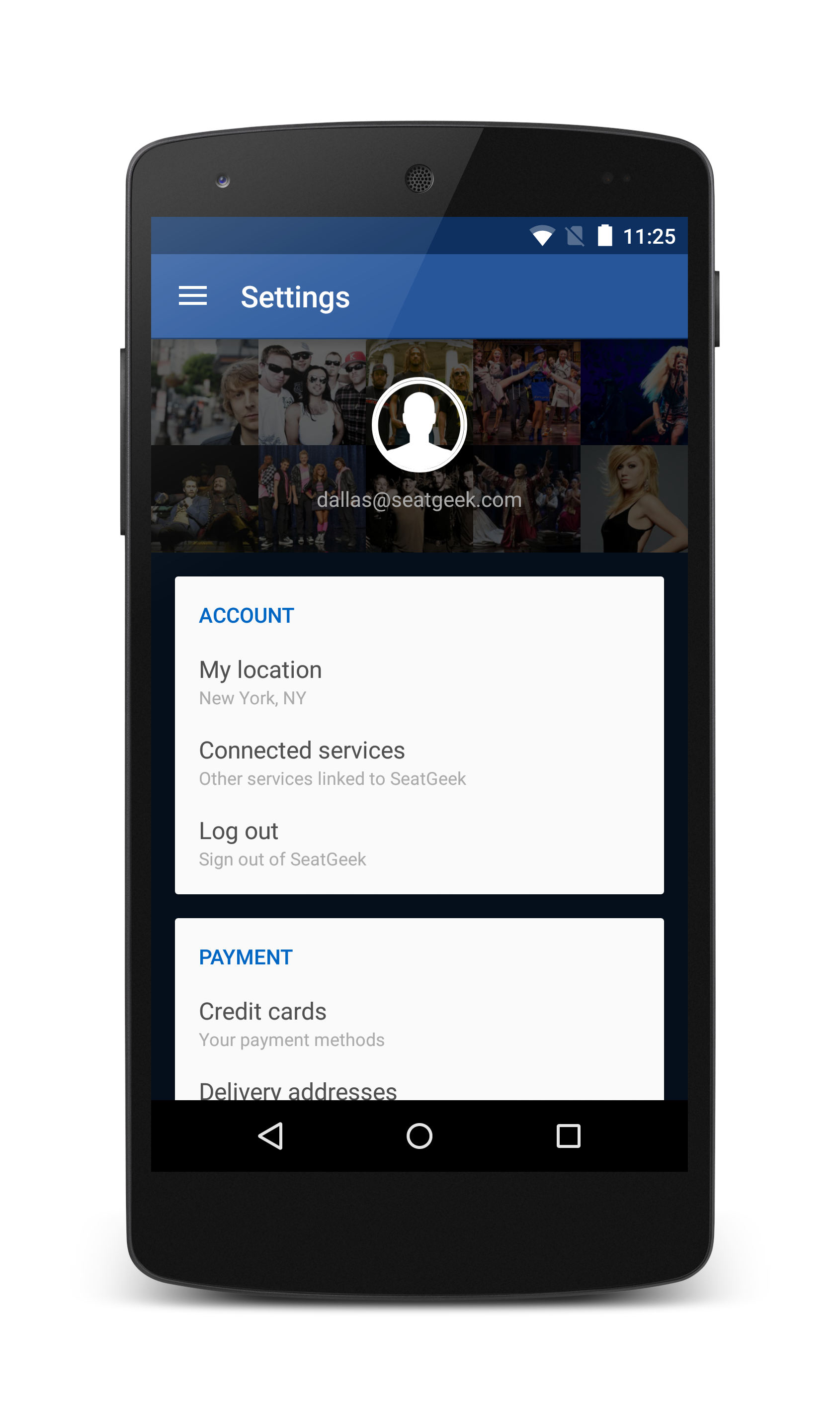
Meet SeatGeek: Introducing Dallas Gutauckis

Name: Dallas Gutauckis

Role: Lead Android Engineer

Hometown: Port Orange, FL

Hypothetical SeatGeek talent show performance: Balancing things… such as a barstool on my finger, a hockey stick on my foot, etc.

Twitter handle: @dallasgutauckis

SGFL (SeatGeek Foosball League) Ranking: 2, 3? Either way, behind the undeniable king of foosball and sobriety, Ben Clark.

What was your path to SeatGeek?

This morning? ​I took the L train into 14 St/Union Square as I often do​ and then walked the few blocks uptown to the office; sometimes, I ride my bike. It’s a cool 7-mile ride.

I grew up programming. I started around age 9 with Visual Basic (whooo! … just kidding) and switched to web development combined with some basic C muddling. I was doing things like modifying game servers to be able to provide user scores to forum software and link accounts (in-game username being the same as the forum username, shared auth, credentials, etc.). From there I focused more on full-stack web development, doing contract work during high school and my first year of college. I dropped out of college to work at a startup in 2007 at a company called myYearbook. I worked on full-stack web development there for about 3½ years.

In 2010 I was attending Google I/O. That was the year they sent all of the attendees a Motorola Droid ahead of the conference and suggested they work on something and come with questions and whatnot to bring to the conference. So, with that, I made my first Android app. I essentially made Words with Friends for Android before it existed. (If you don’t know Words with Friends, think online multiplayer Boggle.) After that, my manager noticed I was doing Android development a lot in my spare time and asked if I’d be interested in working on the myYearbook Android app full-time. I obliged and ended up really loving it.

Our company was acquired in 2011. I stuck around for a while. Then, in late 2013/early 2014, Alex Blum and Jack Groetzinger both reached out to me from SeatGeek asking if I wanted to lead the Android team. It was really a perfectly awesome fit for me. I wanted to move to New York City, and I wanted some new things to work on. I couldn’t be happier with the decision I made to move.

What’s the most interesting project you’ve worked on since joining?

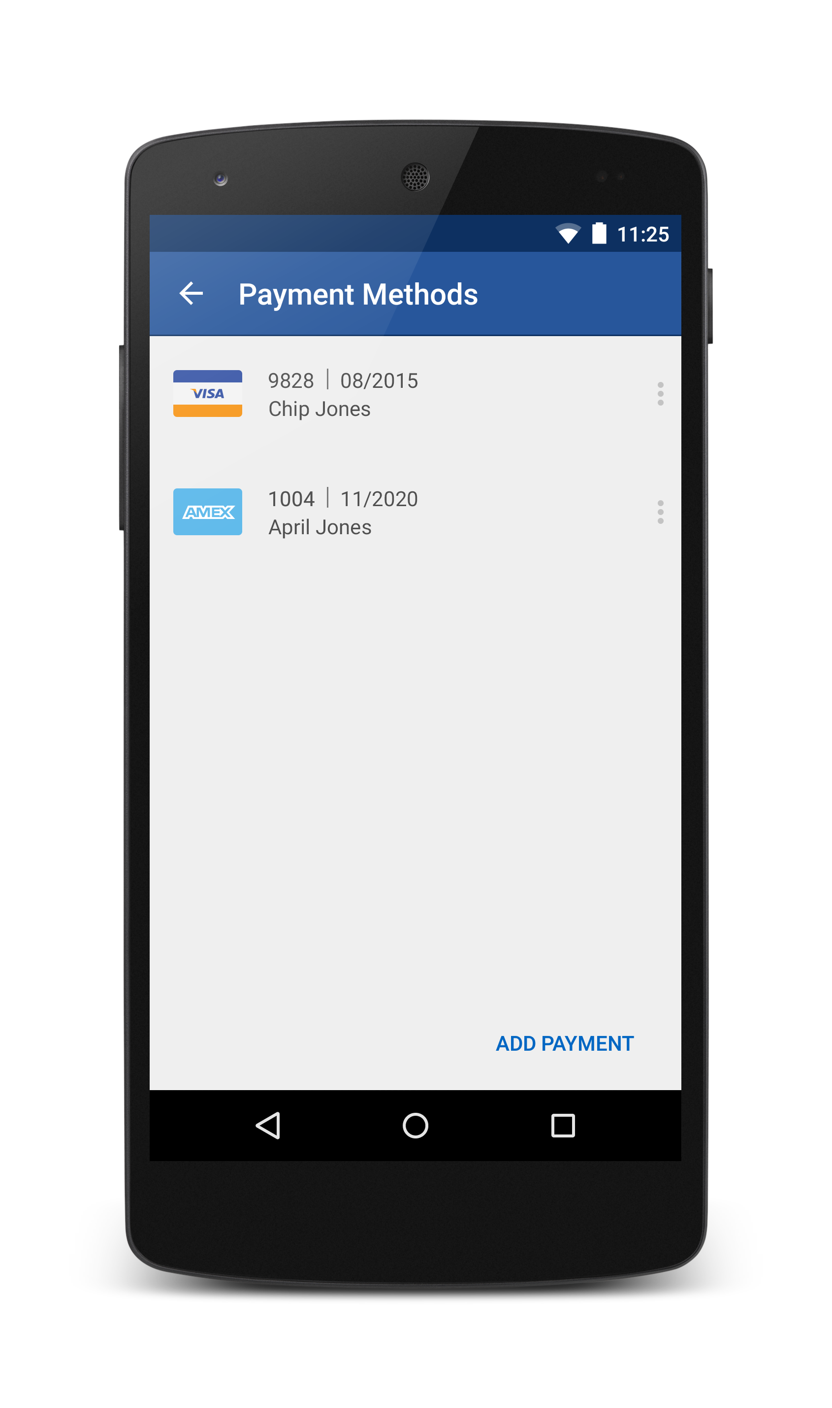
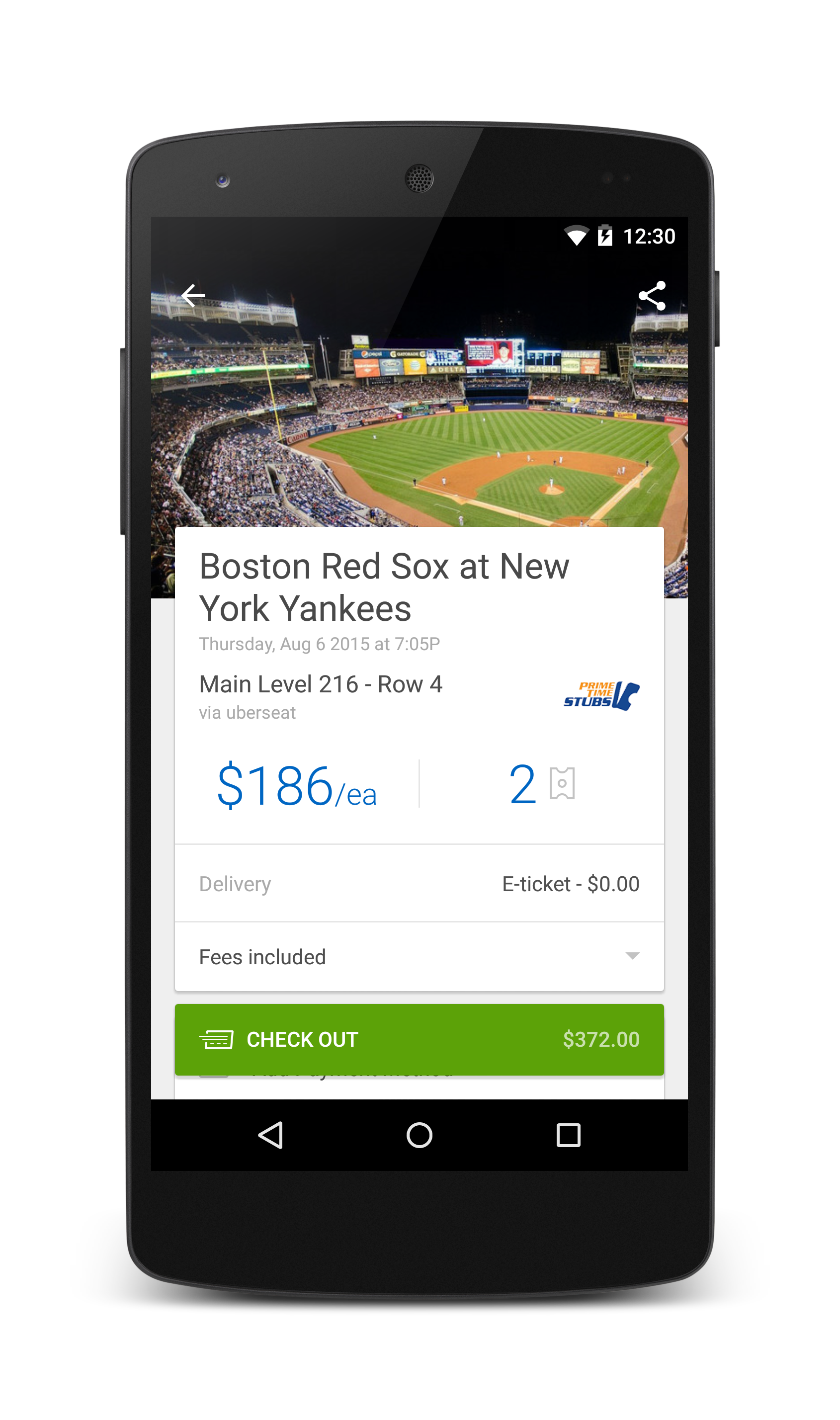
It’s not out yet, but we’re working on adding SeatGeek Checkout to the Android app. SeatGeek Checkout greatly simplifies the purchasing process for users by allowing them to save and re-use their payment information across many different ticket sellers. It’s an obvious win for users, and it’s also an obvious win for us. Checkout presents some exciting technical hurdles for us, especially as we’re working with new technologies like RxJava as well as ensuring we have solid test coverage for Checkout (something we really don’t want to break). We also have some fun new design and UX concepts we’re introducing to the app, so I just can’t wait to see it being used, and — we hope — loved!

What do you want to work on next?

I have really big ideas for revamping our search user experience and would really like to have a refined experience there. I’m hoping we’ll be able to do some design sprint work there as well — a process we haven’t tried out yet.

What’s your favorite SeatGeek experience?

As pretty much everyone at SeatGeek knows (it’s in my onboarding presentation​, as well as in every product presentation I give), I’m a huge fan of the Philadelphia Flyers. I really enjoyed going to the playoff games last year at Madison Square Garden against the Rangers; even after the Flyers lost to the Rangers and the Rangers were playing the Canadiens, I still went to those games with a colleague and had a blast. So, in summary, I’d say that the general experience of going to hockey games with our ticket perk is my favorite SeatGeek experience.

What’s your top NYC recommendation — food, fun, neighborhood, etc.?

I’m a huge fan of breakfast foods and sandwiches, but particularly breakfast sandwiches. Tompkins Square Bagels is one of my favorite places in the city. Mighty Quinn’s Barbeque gets a solid second. Any time a friend is visiting from out of town, I’m sure to take them to both.

What’s the most interesting thing you’ve read recently?

I read The Martian by Andy Weir recently. This book has definitely made the rounds in the tech/science fields, but also in general society (or so I’m told). I really liked the book. I didn’t actually read it, I listened to it on the L train. It’s a bit hard to follow when you’re listening to him rattle off numbers and equations, but I enjoyed it nonetheless. Apparently, there’s also a film scheduled for release in November of this year.

What’s been your favorite SeatGeek team event?

No offense to “Batsu!”, which we went to recently and had an awesome time at, but I enjoyed the hell out of the Arcade Fire concert we went to. The crowd was great, the band was great, the show was great, and hanging out with SeatGeeks was great. What more can I say?

We’re Now the Official Mobile App of Wantickets

Miami Music Week is just around the corner, which makes it a perfect time for us to announce our partnership with Wantickets as their official mobile app partner. Electronic fans are undoubtedly familiar with Wantickets; for over 15 years, they have been a leading dance music ticketer.

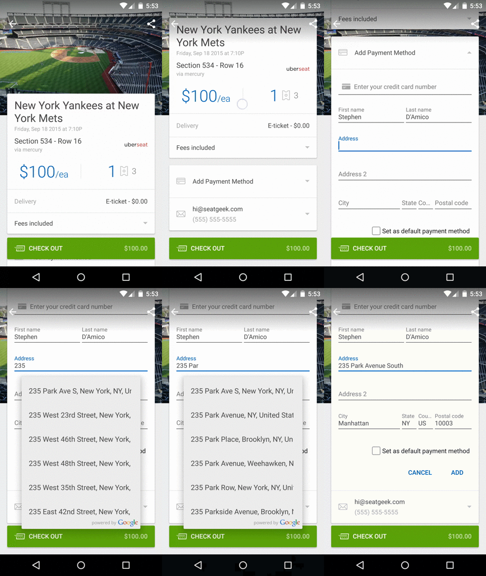
One of the best features of the Wantickets purchase experience on SeatGeek — and this will remain true for all future market integrations — is that users don’t have to leave the app in order to buy tickets. You can store your credit card with us, and then in a few taps, buy a ticket. In the future, we’ll deliver the ticket right to your phone, and you’ll be able to use your device to scan into the event.

CHECKOUT

Electronic is among our fastest-growing categories, and this unique inventory from Wantickets will only add fuel to the fire. Through this partnership, we now ticket events featuring some of the most popular DJs in the world including Avicii, Skrillex, and Diplo.

EDM SALES

This is relatively new ground for SeatGeek. Prior to our Telecharge partnership, we hadn’t integrated primary inventory alongside tickets from the secondary market. Be on the lookout as we continue to add more ticketing partners, expanding SeatGeek’s breadth and utility.

Hiring & Bias, Part 2: Revealing the Pitfalls

Part 1 of this series defined heuristics and cognitive biases and established that everyone is subject to them, whether they know it or not. In Part 2, we’ll diagnose four specific biases that commonly plague interviewers.

Halo effect

A friend of yours recently started dating someone named Amy. You’ve met her a few times, she’s been friendly, and you’ve enjoyed her company. Later you hear that Amy applied for a job at your work. The hiring manager asks you questions about whether she’d be a good fit for the role:

  • Is she smart?
  • Is she hard-working?
  • Is she good with numbers?

You probably don’t know any concrete facts that would inform an educated answer to those questions (e.g. Amy’s test scores, work habits, or her math skills). Nevertheless, you’re more likely than not to answer “yes” to each question. Your general positive attitude toward Amy bleeds into your evaluation of her specific traits, even those about which we objectively know nothing.

This is called the halo effect, because it inclines us to judge other people as all-good (or all-bad, in which case it is sometimes called the “devil,” or “horns” effect).

This bias was named by Edward Thorndike. In 1920, he published a study demonstrating that one flight commander, when asked to rate his cadets across many different dimensions, was likely to give ratings with an unduly high correlation between fundamentally independent attributes. For example, cadets rated as having an exceptional physique were also excessively likely to earn high ratings for intelligence.

In interviews, this poses an obvious risk: A candidate impresses us in one particular regard. Perhaps they are an outstanding culture fit. In reflecting on the interview, we might consequently overestimate their qualification for other, unrelated requirements of the role, like their aptitude with spreadsheets.

First impressions

The halo effect can also arise from baseless, ephemeral judgments. All it takes is a friendly greeting, a firm handshake, or the sight of a face to form a first impression.

Like the halo effect, first impressions are self-fulfilling. Even when we encounter evidence that contradicts our impression, it’s cognitively easier to excuse a conflicting observation and to continue believing in our impression than to change our position. Here’s how that might go in our head:

This guy is great!… Wait, what did he just say?… Eh, that’s an easy mistake. Maybe I misheard. I’m sure what he really meant was this…

In experiments repeated globally, Alex Todorov and others have demonstrated the influence of first impressions with evidence that research subjects can correctly predict the outcome of political elections with 70% accuracy by evaluating the competency of candidates after only viewing their campaign portraits… for as little as a tenth of a second.

If large public elections can be detectably influenced by the glimpse of a face, then it’s alarmingly easy to imagine how that or something equally as trivial – a person’s height, a good hair day, or nice perfume – might contaminate a single interviewer’s decision.

Peak-end rule

Whereas our judgment of other people may be biased heavily by our first impressions, when we remember events, beginnings have relatively little influence. Our overall impression of any experience – how much pleasure or pain we feel during a brief incident, a vacation, or even an entire lifetime – depends on our recollection of a subset of snapshots drawn from the experience.

The peak-end rule posits that we’re very lazy rememberers. By default we’ll most heavily – or, really, only – consider the two easiest-to-recall snapshots. We most easily recall:

  1. the high- (or low-) light of the experience (the “peak”)
  2. the last part of the experience (the “end”)

Psychologists have demonstrated the peak-end rule by inflicting mild pain on subjects using the cold pressor test. They administer the test three times. Each time the trial starts with a 60-second wrist-deep soak in icy water. In one case, the trial ends right after the first 60 seconds have elapsed. In another case, the hand remains in for an extra 30 seconds while the experimenter slowly mixes in warmer water, ever-so-slightly relieving the subject’s pain. In both cases, at the end of time, the subject removes her hand and receives a warm towel. After her second soak, the subject is asked to choose which version of the test she prefers to receive for her third trial.

Subjects should unambiguously prefer the shorter trial (Trial A). The total amount of pain they’ve endured (i.e. the area under the line) is absolutely, unequivocally less in the shorter, 60-second trial. But the majority of subjects choose the longer trial (Trial B), because their memory of the experience is biased by the relief they feel as the warmer water is mixed in – a more pleasant end.

According to the peak-end rule, our recap of an interview is predisposed to be dominated by one or two memorable moments, with less consideration for the events in between. For example, maybe a candidate knocks out of the park a particularly tough, arcane question in the middle of the interview, and finishes with some strong closing arguments. We’d be likely to construct a positive memory of her performance, even if she also gave several subpar, less remarkable answers.

Illusion of validity

Whereas the danger of the previous biases arises from making decisions based on too little real information, surplus evidence can be problematic too. The illusion of validity predisposes us to believe that having more observations always equates to a surer decision.

In a fairly benign case, maybe we have duplicative evidence. We review a resume for an entry-level candidate who earned a high SAT score and also attended a prestigious university. Both are (arguably) positive signals, but in combination neither fact provides much more usable, independent information than the other. (A high SAT score is a prerequisite to get into a good university.) Still, we feel like we have twice as many important signals, and therefore have more confidence in our impression.

In the worst case, the illusion of validity tricks us into making confident decisions even when the signals are totally meaningless. Daniel Kahneman, the godfather of cognitive bias research, cites his experience performing Israeli army officer evaluations as an example of what can go wrong.

Kahneman placed candidates in groups and subjected them to an elaborate physical obstacle course. His team of interviewers (some of whom were also psychologists) observed closely and took diligent notes to distinguish the leaders in the group from the followers. Their rigorous methods and the realistic setting led them to the natural conclusion that a leader identified in the test was sure to be a leader of tomorrow, and thus a strong candidate for army officer.

The observers were so confident in their method that for years, they didn’t bother to validate their predictions by analyzing later performance reviews of the candidates whom they’d promoted. When they did, their predictions turned out to be hardly more useful than a coin flip.

Most strikingly, even after Kahneman’s team learned these results, the obstacle course remained a feature of the screening process longer still, because the method seemed so productive that the team made excuses and tried to discredit the evidence of its futility.

If an elaborate experiment conceived of by professional psychologists can fail this spectacularly at producing meaningful signals, then we should be very skeptical of our own interview questions – even if they feel targeted and productive.

Overconfidence and the bias blind spot

Cognitive biases lead us to make poor decisions. We go to great lengths to gather meaningless data. We discard perfectly good information. We invent sometimes baseless narratives to fill in the gaps. In spite of these intuitive flaws, we plow ahead confidently. This act – failing to recognize the holes in our logic and the low reliability of our decisions – is a symptom of yet another bias: the overconfidence effect.

Cruelest of all, even when we think we might have mastered this, we’re wrong. Emily Pronin, coiner of the phrase “bias blind spot,” has demonstrated that learning about cognitive biases only helps us diagnose them in other people’s behavior. Subjects who’ve been instructed about a bias – even immediately before being put to the test – are still no less likely to succumb to the bias and overrate the objectivity of their thought process.

This would be a pretty hopeless place to end this series: concluding that have we no control over the systematically bad decisions that we make. Though eliminating the influence of bias in our decisions in certain situations might be next-to-impossible, re-engineering – or, better, completely avoiding – those situations is not. In Part 3 (coming soon), we’ll see how this idea applies to interview decisions.

Want to learn more about biases? Here’s some reading material:

Meet SeatGeek: Introducing Zach Sherman

Name: Zach Sherman

Role: UI Engineer

Hometown: Bedford, NY

Hypothetical SeatGeek talent show performance: Eating a ghost pepper

Twitter handle: @zshrm

SGTTL (SeatGeek Table Tennis League) Ranking: 2

What was your path to SeatGeek?

I’ve always loved the web, started learning to design/code in high school and freelanced all the way through college. I’ve worked with a lot of cool companies over the years and even started a few of my own. I studied economics at Vanderbilt and graduated in 2014, took a quick pit stop in Japan and headed right for SeatGeek.

What’s the most interesting project you’ve worked on since joining?

I’ve worked on a lot of cool things from the Living Social partnership to implementing SeatGeek checkout on mobile, but my favorite project so far was probably the redesign of our General Admission pages.

What do you want to work on next?

I would really love to work on the next release of Sixpack, our a/b testing framework. I think it could be made even more accessible, allowing anyone at the company to run a/b tests by clicking a few buttons and pasting in some custom code.

What’s your favorite SeatGeek experience?

Sylvan Esso at Bowery Ballroom. Hands down.

What’s your top NYC recommendation – food, fun, neighborhood, etc.?

Porto Rico is my favorite coffee shop in NYC. They have dozens of burlap sacks filled with beans from around the world – the smells are heavenly. There’s also a fantastic Filipino restaurant I love in the East Village called Jeepney. I know it sounds weird, but try the banana ketchup ribs.

What’s the most interesting thing you’ve read recently?

Emotion & Design: Attractive things work better

What’s been your favorite SeatGeek team event?

Workation in the Hamptons.

LivingSocial Deals, Powered by SeatGeek

It’s exciting for me to be able to write about our new partnership with LivingSocial. In a way, it’s been 5+ years in the making – I first met Alex Michael, Head of National Sales and GM of Entertainment at LivingSocial, when he was running business development at Madison Square Garden in late 2009 – but it actually wasn’t until the fall of 2013 that Alex and I had the first of many conversations that would eventually lead to offers like this on LivingSocial:

https://www.livingsocial.com/events/1399080-new-york-mets-vs-washington-nationals?pos=2

One of LivingSocial’s best-performing categories of late has been live events. Their platform surfaces deals that provide not only discounted experiences, but premium entertainment experiences as well, making a SeatGeek-LivingSocial partnership a perfect fit; LivingSocial has millions of users looking for great live-event experiences, and SeatGeek offers the best technology to find great ticket deals to hundreds of thousands of them.

We launched the partnership in mid-February, and it’s already been immensely successful. LivingSocial users now have access via SeatGeek to the best deals on hundreds of live events across the country, and they’ve already purchased thousands of tickets in the first few weeks of the integration.

You can find these deals on LivingSocial’s site and mobile apps, and it’s the full SeatGeek experience: an interactive map of the venue, Deal Score, view-from-seat images, the whole nine yards. Here’s what it looks like in the LivingSocial Android app:

While Alex and I may have started the beginnings of this relationship over five years ago, there are many people from LivingSocial and SeatGeek, both on the tech and business side, who contributed tremendously to this partnership. Look for even more SeatGeek-powered deals to come to LivingSocial in the weeks and months ahead!

Hiring & Bias, Part 1: The Trouble with Shortcuts

Interviewing is like dating. You meet people, you learn about each other, you eventually become exclusive and agree on a title. And sometimes you make mistakes.

At SeatGeek, we’ve been putting ourselves out there. We average almost 50 interview rounds per week. Even with 35 interviewers (~70% of our total headcount), that’s roughly three interviews per person per week. (An average interview round consists of 2-3 interviews conducted by different people.) In any given week, there are likely several team members with eight or more interviews in their calendars.

It wasn’t always this way. Until recently, we didn’t even have the mechanics in place to measure interviews per week, company-wide. But a quick look at a chart of our hiring rate instantly reveals when and how much we turned up the heat:

Our reorganized hiring process has increased the growth rate of the SeatGeek team by almost 5x. We used to add a new employee every 65 days on average. Now it’s every 13 days.

Background

Like most startups, we believe deeply in the excellence of our team. Not long before our change, almost all hiring tasks – sourcing, screening, and interviews of every round – were carried out by our founders. Thus, the high caliber of our team was most easily accredited to the two of them.

In order to increase our hiring throughput (which had become unsurprisingly bottlenecked), we recruited people from every team and level at SeatGeek to join the interview team. Like most people who’ll read this post, none of us are professional interviewers, but rather professional engineers, marketers, designers, etc. Many of us are more accustomed to sitting on the receiving side of an interview table.

To say the least, it was unsettling to stake the future of our business and team chemistry on a motley assortment of relatively inexperienced interviewers. We didn’t know if it was possible to produce in this way the same quality of hiring outcome as our founders had managed to achieve so far.

The problem

Our interviewers are all different. We each have unique skills, experiences, and personalities. But regardless of differences, we uniformly trust each other’s expertise in our given domains. Counterintuitively, it’s not our dissimilarities but rather the one thing we all have in common that poses the main threat to our hiring process:

We’re all human. And humans make mistakes.

Heuristics

Matching a person to a job is a difficult, complex problem. The perfectly straightforward way to know if someone is the right fit for a job is to hire them, wait a few weeks (or longer), and evaluate their performance. Except for a few cases (e.g. contract-to-hire jobs), this is almost always impossibly impractical. An interview exists to foretell the same outcome – whether a candidate is good or bad at a job – in a compressed format, without the need to actually hire them and find out.

In this way, an interview is a heuristic – a logical shortcut or “rule of thumb” that enables one to make a decision based on only limited information.

Heuristics aren’t just nifty, but pivotal for survival. Consequently, they’re deeply ingrained in human decision-making processes. Whether or not you know the definition of the word, you use heuristics. Everyone does, every day.

Some heuristics, like “trial and error” and “working backward,” are well-known because they’re applied very intentionally. Others – like the availability, affect, representativeness, and familiarity heuristics – aren’t as well-publicized, but nevertheless they form the basis of our intuitive thinking.

Biases

The chief hazard with heuristics is misapplying them: in the wrong situation, to an excessive extent, and – most insidiously – without realizing it. We commit these errors all the time, and often in predictable patterns. When psychologists observe a heuristic systematically leading humans to make a suboptimal choice under a set of circumstances, they call it a cognitive bias.

Optical illusions (like the one below) are a helpful metaphor for grasping how stealthy cognitive biases can be. No matter how carefully you consider the left image below, square A will appear darker than square B. But this is false.

(Bonus: Here’s a gif of the same illusion.)

Imagine that an important decision hinged on our ability to correctly evaluate the color of those squares. Without the guidelines in the second image, we’d be very wrong – and have no reason to suspect it.

Interview rooms are dangerously fertile territory for cognitive biases. Without acknowledging the pitfalls, we risk conducting interviews that confound good hiring decisions. In Part 2, we’ll catalog a few cognitive biases of which every interviewer should be wary.

Keep reading

Meet SeatGeek: Introducing Spencer Noon

Welcome to the first in a long line of profiles that will hopefully get you better acquainted with our kick-ass team.

By day, we’re a group of talented developers, designers, marketers, and businessfolk working together to build something new and different. We represent live event junkies of every kind: diehard sports fans, passionate concert-goers, sophisticated theater enthusiasts, and more. From our lives outside the office and before SeatGeek, we all have interesting stories to tell.

First up…

image

Name: Spencer Noon

Role: Business Development

Hometown: Farmington, CT

Hypothetical SeatGeek talent show performance: Italian opera singing

Twitter handle: @spencernoon

SFL (SeatGeek Foosball League) Ranking: 6th and climbing

What was your path to SeatGeek?

I graduated from Amherst College in 2013 and started my career off in wealth management/private banking at UBS in their Graduate Training Program. After 10 months, I left the firm to start a bitcoin company backed by a major professional sports team owner. Building a startup from the ground up was an incredibly rewarding experience, but the uncertainty of virtual currency regulations in New York forced me to abandon the project. I joined SeatGeek in October as the business development team’s first hire and it’s been an amazing experience thus far.

What’s the most interesting project you’ve worked on since joining?

The most interesting project I’ve been working on is onboarding primary market inventory onto the SeatGeek platform. We’re cutting deals with many of the major ticketing companies to become an extension of their box office and help their clients sell more tickets. It’s a great feeling knowing that because of this project, our users are shopping a growing number of primary markets and making increasingly more informed ticket purchases.

What do you want to work on next?

There isn’t a whole lot I can talk about, but we have a few really cool partnerships in the pipeline that will help to establish SeatGeek as a major national brand, and that gets me really excited.

What’s your favorite SeatGeek experience?

I try to catch as many NBA games as possible with our company’s ticket perk, so my favorite experience was seeing Nets vs. Timberwolves at the Barclays Center back in November. It was my first time seeing the arena, and I was fortunate to find seven seats in a row and sit with some of my closest friends. Also, don’t laugh, but I find the Timberwolves to be one of the NBA’s most exciting young teams!

What’s your top NYC recommendation – food, fun, neighborhood, etc.?

It’s a café called Gotan, located on 130 Franklin St. in Tribeca. Order the Scrambled Cheddar Biscuit and thank me later.

What’s been your favorite SeatGeek team event?

The SeatGeek holiday dinner was epic, and that’s about all I can say on the record.

The Continuing Beautification of SeatGeek Seating Charts

Providing our users with the best seating maps in the ticketing industry is a top priority at SeatGeek. Seat location is one of the most significant factors in the decision-making process behind a ticket purchase, and it’s important to us to give that variable as complete and accurate a context as possible.

To that point, for years we’ve provided best-in-class features in our seating charts, like row-level mapping (above and beyond the industry standard of section-level mapping), view-from-seat images and interactivity, and most recently, we’ve focused on enhancing the beauty and dimensional accuracy of the playing surfaces at sporting venues.

We’ve approached this enhancement the way we have many other mapping projects before it – with an eye for detail and care for the user experience that you don’t find elsewhere in our industry. We’ve used a combination of primary sources – architectural floor plans, 3D renderings, high-resolution photography and satellite images – in an effort to take into account everything from dimensions and playing lines to on-field designs.

These enhancements are live for the following venue types:

  • Basketball (NBA & NCAA)
  • Football (NFL)
  • Soccer (MLS & UEFA)

NBA basketball

We’re big basketball fans, especially this time of year. Football season is over, baseball season is only warming up, and many of the most exciting live events in February and March happen on the hardwood. We’re excited to have these beautiful new seating charts live for all 30 NBA arenas:

image image image image image image image image image image

Notable NBA floor designs

I also want to take the chance to call out a few truly unique design additions we’ve made to a handful of NBA venues:

Hardwood parquet floor: Boston Celtics (TD Garden)

City skyline floor design: Cleveland Cavaliers (Quicken Loans Arena)

“Giant pelican” floor design: New Orleans Pelicans (Smoothie King Center)

NCAA basketball

Rather than copy the dimensions and playing lines from our NBA maps, we’ve incorporated NCAA-specific elements (e.g. the shorter three-point line and smaller size of the key) into the seating charts of our college basketball venues:

NCAA basketball: Final Four (Lucas Oil Stadium)

NCAA basketball: Rice Owls (Tudor Fieldhouse)

Football (NFL)

Let’s use the Baltimore Ravens’ M&T Bank Stadium as an example of the new on-field look we’ve given our NFL maps.

The following are side-by-side comparisons of a primary source and the current version of the SeatGeek seating chart for that venue, followed by a before-and-after. Note the added specification of team sidelines:

Satellite image source vs. current SeatGeek map

Old version vs. current version

Hockey (NHL)

Want to know on which side of the venue the penalty box is located, on which side of center ice you can find each team’s bench, or on which side the home team shoots twice? Now you can on SeatGeek. Let’s look at the Boston Bruins’ TD Garden as our example:

3D rendering source vs. current SeatGeek map

Old version vs. current version

Soccer (MLS & UEFA)

FC Barcelona’s Camp Nou is a great example of the special care we’re giving to soccer venues. In addition to more accurate section and field dimensions, we’ve added details like the stenciled “MÉS QUE UN CLUB” (“More than a club”) in the mezzanine and the “BARCELONA” and “VISITORS” team dugouts:

Satellite image source vs. current SeatGeek map

Old version vs. current version

Future enhancements

In the coming months, keep an eye out for similarly awesome redesigns of these venue types:

  • MLB and NCAA baseball
  • ATP, WTA and ITF tennis
  • Formula 1 and NASCAR racing
  • IBF, WBA, WBC and WBO boxing
  • UFC fighting
  • WWE wrestling

Want to help us create and improve the greatest seating maps in the world? We’re hiring!

Announcing: Tip-Off Tour

You just used your trusty SeatGeek app to score a ticket to see LeBron and the Cavs take on J Wall and the Wizards in D.C. How easy was that?

What if I were to tell you that your game ticket includes an invitation to SeatGeek’s Tip-Off Party, where you can drink ample beer and eat some great bites fo’ free? Would you believe it? You better believe it!

In addition to creating the best experience for users shopping for live event tickets, SeatGeek also aims to create the best experience surrounding your game night. Therefore, we’re rolling out a set of pre-game parties at Penn Social in D.C. before select Wizards games. Here’s how it works:

tip-off banner

  1. Log into your SeatGeek account on your app or our website.
  2. Buy a ticket to one of these select Wizards home games:
  3. Get an invite via email to the Tip-Off party at Penn Social right around the corner from the Verizon Center.
  4. Show up with a smile and have some drinks, eats and fun. Be sure to share all of your photos to #SGTipOff

What can you expect at a Tip-Off party? Besides free beer and a free buffet of bites, we’ll be hanging out with other Wizards fans who bought tickets on SeatGeek and playing games with prizes such as Wizards gear, SeatGeek swag and future Wizards tickets. Some lucky people may even get their seats upgraded to the game that night! Wait, we said free beer and food, right?

Expect to see more SeatGeek events surrounding the tickets you buy to games, concerts and Broadway shows. Whether it’s a pre-game party before you see your favorite team, a soundcheck experience with your favorite band, or a meet & greet experience with the cast of a Broadway show — it’s just our way of saying thanks for being you, good-looking SeatGeek user.

Have any questions, comments or feedback? We want to hear it! Send an email to party@seatgeek.com.