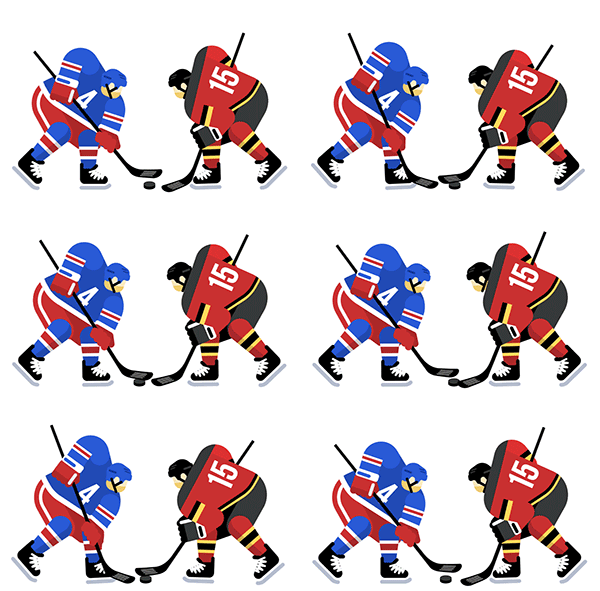
Visual aesthetic is inherently a part of any live event experience, whether it’s a sporting event, concert or Broadway show. We’ve always focused on trying to capture the rich imagery of sports and music with performer photos, detailed venue mapping and view-from-seat photos, but we’ve recently begun to bring our live event visuals to life as well.
If you’re a SeatGeek user and fan of an NBA or NHL playoff team, chances are you’ve seen one or more of our animations in your inbox. What I’d like to do here is share some insight into my design process and hopefully inspire you to explore the tools and resources out there that you can use to create animations of your own.


Getting started
Before putting pen to tablet, I like to look around and see what’s out there for both inspiration and reference material. When thinking about imagery for our NBA and NHL playoff emails, I turned to sports blogs and news sources for photo references, but my go-to sites are dribbble, niice.co and designspiration.

Sketching
This is the most important step in my design process. It helps eliminate any lame ideas and figure out what will and will not work. Personally, I love using a Wacom tablet and Photoshop; you can duplicate ideas and mess things up (in a good way) very quickly.
.png)
Typically, an idea starts out as either mega-rough, rough, or close-but-no-cigar, but if the feeling is right with even a mega-rough idea, you can often skip the latter two stages and move straight into Illustrator.
Artwork
At this point, there is still some decision making going on: Can I remove anything? Can I add anything? “Less but better” is a mantra I try to live by. It’s easy to confuse simplicity with lacking detail and difficult to strike a balance between the two. It’s easy to get caught up fussing over minutiae; I often find myself in the land of endless-possibilities-and-details.

I still watch a lot of tutorials on creating vector art, because there’s always something to new to learn. I highly recommend http://www.pixelcasts.io/ if you’re looking to soak up some valuable Adobe Illustrator knowledge.
Animation
Going into the animation process, what I try to do is reduce the number of layers and groups in Illustrator. Keeping the shoulders, arms, stick and hands all together makes life much easier once you get this into After Effects.
We can create simple layer structures in Illustrator that will then be matched in After Effects after importing.

If you’re interested in learning more, I can’t recommend this Skillshare class on Simple Character Animation enough. It’s where I learned most of what I know about After Effects animation!

